How To Use Google Analytics Motion Charts To Maximize Results
Last year Google Analytics released a few new features, among them the Motion Charts. The feature is based on software developed by Gapminder, acquired by Google in 2007. According to the Google Analytics blog, “Motion Charts provide a multi-dimensional, over-time analysis of the data in your report.” This feature provides a powerful way to visualize […]
Last year Google Analytics released a few new features, among them the Motion Charts. The feature is based on software developed by Gapminder, acquired by Google in 2007.
According to the Google Analytics blog, “Motion Charts provide a multi-dimensional, over-time analysis of the data in your report.”
This feature provides a powerful way to visualize data in five dimensions: x-axis, y-axis, size of bubble, color of bubble, and time. In fact, if you choose metrics that are combinations of more than one metric, such as conversion rates (number of conversions divided by number of visits) bounce rate (number of bounces divided by number of visits), and Pages/Visit (number of pages divided by number of visits), you can even increase the number of dimensions to eight.
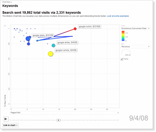
Here’s an example of a Motion Chart:
When it comes to search marketing, Motion Charts can bring significant value in the following ways:
Improve SEO keyword targeting. As we will see in the examples below, one of the advantages of Motion Charts over other forms of visualization is that it enables the analysis of large numbers of keywords across several parameters. This helps finding emerging keywords both in terms of traffic and performance. In addition, by analyzing bounce rate trends for keywords, we get a feel for landing pages that are underperfoming.
Expand PPC keyword targeting. By analyzing SEO targeting and results (as above), we can understand which organic keywords can present an opportunity to tap into new markets. Sometimes visitors get to the website using keywords that were not previously thought of as a match for the website. Motion Charts can uncover these “hidden” gems, allowing us to incorporate them into paid search campaigns.
Analyze PPC keyword performance. Paid search optimizers often fall into the trap of analyzing the average performance of campaigns or keywords. However, as Avinash Kaushik says about disappointing measurement techniques, “averages have an astonishing capacity to give you “average” data, they have a great capacity to lie, and they hinder decision making”, therefore the need to analyze not only averages, but segmented traffic and trends over time.
How to choose data displayed on a Motion Chart
As we saw above, Motion Charts can be very useful when analyzing search traffic whether we are looking into organic or paid traffic. In the screenshot below we see the keywords report (which can be reached from the Traffic Sources section). We will use it to exemplify how to populate the Motion Chart in the best possible way, according to the website owner needs.

The screenshot uses Google Analytics data from this Global Warming website.
It is important to understand that the Motion Chart data is defined by the report from where it was triggered. Here are the 5 parameters that should be defined carefully:
Keyword medium. Just above the chart, in the upper-left side, you will find three links: all, paid and non-paid. This can be used to analyze all keywords, just paid keywords, or just non-paid (organic) keywords.
Time range. As with all Google Analytics reports, time range can be adjusted from one single day to a few years worth of data. In order to neutralize time series effects I recommended analyzing at least a few weeks worth of data. Searcher behavior varies between the days of the week, the weeks of the month and the months of the year. Therefore, when analyzing daily behavior I recommended analyzing at least eight days (1 week + 1 day). When analyzing weekly behavior, at least 5 weeks (1 month + 1 week) and when analyzing monthly behavior analyze at least 13 months (1 year + 1 month).
Data grouping. This refers to the grouping of data into daily, weekly or yearly buckets. If you choose a six month range and group data in months, you will see six data points on the Motion Chart time-axis. If you choose the same date range but group it into days, you will see around 180 data points in the time axis.
Show rows. With Motion Charts it is possible to analyze up to 500 keywords in one shot. By using the drop down in the bottom-right corner of the table, you can include 10, 25, 50, 100, 250 or 500 keywords in the Motion Chart (although more than 25 keywords is a bit cluttered).
Filter keyword. This can be used to include or exclude keywords on the report. Keyword filters a very useful in when analyzing branded vs. non-branded keywords separately, or to analyze groups of words that hint at specific segments of visitors. It is possible to use regular expressions to build complex patterns if simple filters aren’t adequate for your needs.
After choosing your parameters, click on the visualize button above the chart (see top-left gray buttons on the figure above). This builds the Motion Chart for you.
How to choose Metrics to be analyzed on the Motion Chart
As with all web analytics analyses, the most important step when using the Motion Chart is to understand the website objectives and what metrics should be used to measure and improve these objectives. Often, your objective will be determined by whether yours is an ecommerce site or not.
When ecommerce is enabled in Google web analytics, interpreting results gets very intuitive. You know, for example, the value of a specific keyword (be it organic or paid) because you know how much revenue it brought. In the example below, the following metrics were chosen to be analyzed:
Visits (y-axis) shows the amount of visits for each keyword.
Bounce rate (x-axis) shows the % of bounces for each keyword. This is very helpful since it hints at whether a keyword matches the landing page or not—in other words, are you delivering the promise you give on your PPC ads or search result snippet? As Bryan Eisenberg writes: “keywords don’t fail to convert… we fail to convert visitors for that keyword.” Look for keywords far from the y-axis, especially red and/or big ones. Tip: optimize the landing page for these keywords.
Ecommerce conversion rate (color of bubble) shows the conversion rate for a keyword. This is important since you might have high converting keywords that are not receiving enough traffic. Look for red-small bubbles located close to the x-axis—thee keywords should get priority optimization treatment. Tip: increase exposure of these keywords on the website (and other SEO efforts) and focus on these and related keywords on your PPC campaigns.
Revenue (size of bubble) shows the amount of money this keyword is driving to your website. Look for big-blue bubbles—this is a signal that a keyword brings lots of money but could bring even more if it converted better. Tip: optimize the pages related to these keywords to improve conversion.
For websites that do not sell online (or for those that do not use Google Analytics ecommerce feature), we would analyze results using slightly different metrics.
Visits (y-axis) is the same as above.
Bounce Rate (x-axis) also the same as above.
Goal conversion (color of bubble). For websites that do not sell online, we can measure site success using several parameters: registrations, whitepaper downloads, comments from users, etc. It is highly important to have these goals configured on Google Analytics. We use goal conversion in a similar way we used ecommerce conversion rate above: to see keywords that convert well but do not get enough traffic.
Per visit goal value (size of bubble). Another important setting on Google Analytics is the $ index variable. It is used to understand the contribution of each source/page (in this specific case, keywords) of the website to conversions. In the Motion Charts this metric can be used to show how much revenue each keyword brought to the website.
The Motion Charts you create can be shared by sending a link to your colleagues directly from Google Analytics; this link will lead people to the exact same chart you created (note that the viewer must have access to the Google Analytics account). However, if you want to present the results to management and are not willing to trust internet for meetings, or if you want to share the results in a website widget, I recommend three alternative ways to share Motion Charts:
CamStudio is an open source screen recording tool that lets you record your screen very easily. This has the advantage that you can use Google Analytics as usual and just record the resulting chart. This might be handy for presentations, and you can also share it in a website using a YouTube widget. However, it has the disadvantage that you cannot interact with the chart and change its settings.
Google Docs Gadget is a great way to share, because it keeps all the functionality of the Motion Chart and you can change the settings as you analyze the numbers. Viewers do not need access to the Google Analytics account in order to view the chart. However, you will need to export the data and organize it in Google Docs, which might take a considerable amount of time, especially for large quantities of data (explanations on how to format the data). Unfortunately, as of today, the gadget works with Firefox but not with Internet Explorer or Chrome.
Successive screenshots: although this is far from optimal, since you lose the motion effect and you cannot interact with the chart, it might be needed to include in Powerpoint presentations or if you want to hide your company’s data (pictures are easier to edit than videos).
I believe that Motion Charts are more than just cool graphs—they really provide some deep visualization that is difficult to achieve through other tools. Motion Charts can be used together with other Web Analytics techniques to optimize search traffic results.
Bonus – if you ever thought that geeks are not talented when it comes to singing and playing the guitar, here is the proof that analysts know something about music: Motion Charts anthem.
Below is a Motion Chart created using Google Analytics taken from Google’s official Youtube channel; it was recorded and shared through YouTube:
If you have additional ideas on how to use this feature, please share them in the comments.
Contributing authors are invited to create content for Search Engine Land and are chosen for their expertise and contribution to the search community. Our contributors work under the oversight of the editorial staff and contributions are checked for quality and relevance to our readers. The opinions they express are their own.
Related stories
About the author