Visualizing SEO: Why Visualizing SEO Data Matters
Columnist Janet Driscoll Miller discusses the importance of data visualization and shows some of her favorite tools for the job.

A few weeks ago, I was at SMX East, and during the Advanced Technical SEO session, Ian Lurie of Portent Interactive gave a fantastic presentation about data visualization.
That got me thinking further about why data visualization for SEO is so important. As SEOs, we have loads of data available to us, but data means nothing if it cannot help us make convincing arguments or reveal important trends and insights.
Why is it important to help others visualize data? At a presentation I attended recently, Tamsen Webster of Oratium illustrated this well with a simple example. If I share a number — such as 888,246 — does that number have meaning to you? That number represents all of the British soldiers who died in World War I. But the number itself, while it has some level of meaning, still may be difficult for our brains to process in context without visualization.
Now, contrast that number with this image:

Image from The Guardian. Photograph: Massimo Crisafi/GuardianWitness
The image, in which each ceramic poppy represents a British life lost, helps convey the full message to your brain, and it is likely much more impactful to you than simply reading the number 888,246. Visual representation helps us tell the full story in a meaningful, impactful way.
The King Of Data Visualization
To fully embrace data visualization and its impacts, I highly recommend starting with the lessons from data visualization pioneer Edward Tufte. For years, Tufte has been a statistics professor at Yale. His vision on data and images boils down to a simple philosophy: visually demonstrate data so that it tells a story, and don’t use graphics gratuitously. Graphics should convey information.
One of Tufte’s principles centers around combining multiple data types into a visual display. One of the earliest displays of this principle is evident in this map by 19th century French civil engineer Charles Minard, featuring Napoleon’s Russian Campaign of 1812, which Tufte features in his first book.
What is most notable about this map is that it is not just a map of the campaign but also represents the dwindling numbers in Napoleon’s ranks as the campaign progressed.

By Charles Minard (1781-1870) (see upload log) [Public domain], via Wikimedia Commons
As SEOs, we’re often faced with a similar task: How do we include relative data into a visual that can tell the story of what is happening?
Tools
Surprisingly, there are many good visualization tools out there that are completely free. Here are a few of my favorites:
Microsoft Excel
It probably goes without saying that Microsoft Excel is a prominent tool in the SEO toolbox for analyzing data. Excel has all of the basic charts you’d expect, like lines, bars, pies and more. But one chart that isn’t commonly found in other charting tools is the bubble chart.
The bubble chart is definitely handy when you have lots of data points and lots to communicate about each one, similar to the Russian Campaign chart above. For example, let’s say I want to download search query data from Google Search Console:
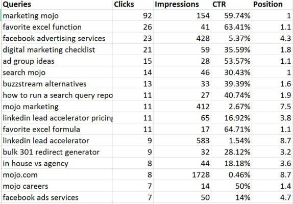
While this is very interesting data, it’s difficult to really show trends with a table. Using a bubble graph, we can see some distinct trends:
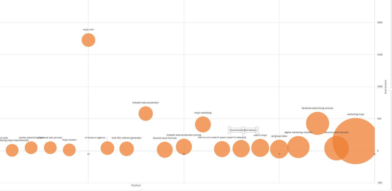
[click to enlarge]
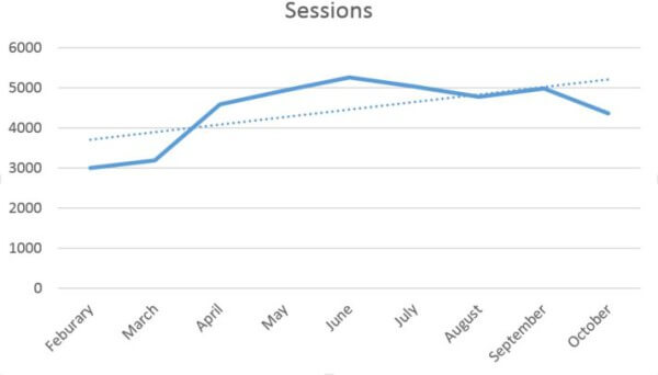
Another helpful feature available in many charting tools is the trend line. Consider creating line charts with trend lines to demonstrate trends over time, such as overall organic traffic growth. This can be helpful to see longer-term trends versus short outliers, such as seasonality, that could muddy the overall picture of SEO growth.
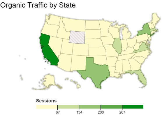
Google Fusion Tables
This is my latest data visualization love. Google Fusion Tables, an experimental app available through Google Drive, allow you to essentially fuse two types of data into one to create a visualization. Another awesome feature of Google Fusion Tables is the ability to merge with other data that are already online.
You can publish your data visualizations on web pages, but there’s no way to save visualizations as an image format. Instead, I’ll often take a screenshot of the area and save it. Alternatively, you can also use Datawrapper (see below), which allows you to export images if you set up a free account.
Here’s an example I ran for organic search traffic by state using an “intensity” map. Which is more appealing — the data in a basic table, or the intensity map?


Note: You must add the Google Fusion Tables app to your Google Drive — it’s not there by default.
Google Charts
Google Charts provides a free and easy way to create charts quickly to add to a web page. This is especially helpful if you have a dashboard or client access area of your website where clients can view their data online.
It’s also helpful if you have an internal system you want to hook to various APIs and create your own monitoring dashboards internally. Google Charts are highly customizable and are perfect for dynamic data sets. Especially nice for dashboards is the gauge chart, which is helpful for measuring status of certain metrics:

Datawrapper
I recently began using Datawrapper for some of my graphing, as well. It offers a myriad of charting options, and all you have to do is upload your CSV to get started. One of the best aspects of Datawrapper is that it uses a wizard-like interface to walk you through graph creation. You can save your graphs as images for a fee, but it’s only 12 Euros per month.
Here’s that same data set from above, but this time created and exported using Datawrapper:
What I specifically like about Datawrapper over Google Fusion Charts is that a) Datawrapper is highly customizable, and b) there are more chart options, including donut charts, which really jazz up the boring old pie chart.
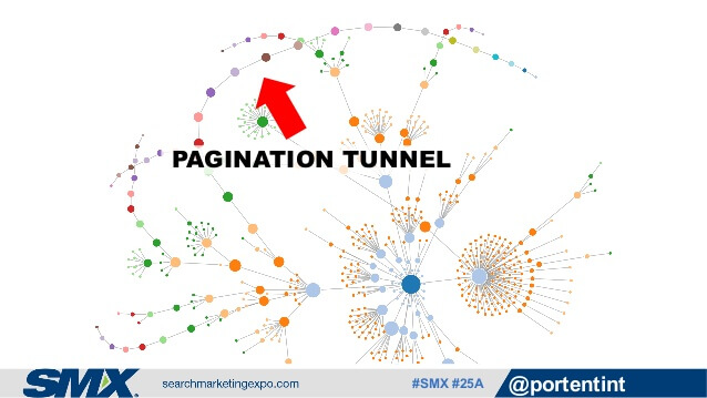
Gephi
Ian Lurie featured Gephi in his SMX presentation. Gephi is great for creating visualizations around pages, links, and their relationships, like this graphic from Ian’s presentation illustrating a pagination tunnel (really several) on a website:
Want More?
Now that I’ve shown you the exciting possibilities of data visualization, I also recommend that you consider following Annie Cushing’s Annielytics page on Facebook and her personal account on Twitter, where she publishes helpful visualization tips and tricks.
Contributing authors are invited to create content for Search Engine Land and are chosen for their expertise and contribution to the search community. Our contributors work under the oversight of the editorial staff and contributions are checked for quality and relevance to our readers. The opinions they express are their own.
Related stories
About the author