Google Maps updates map design, highlights areas of interest and adds business photo carousel
Check out the new look for the Google Maps imagery and features. It is subtle, but Google said it helps users navigate.
Google has updated the design of the maps interface to make it easier for their maps users to navigate and discover places. This update was done across Google Maps on desktop, Android and iOS and specifically impacts the maps interface.
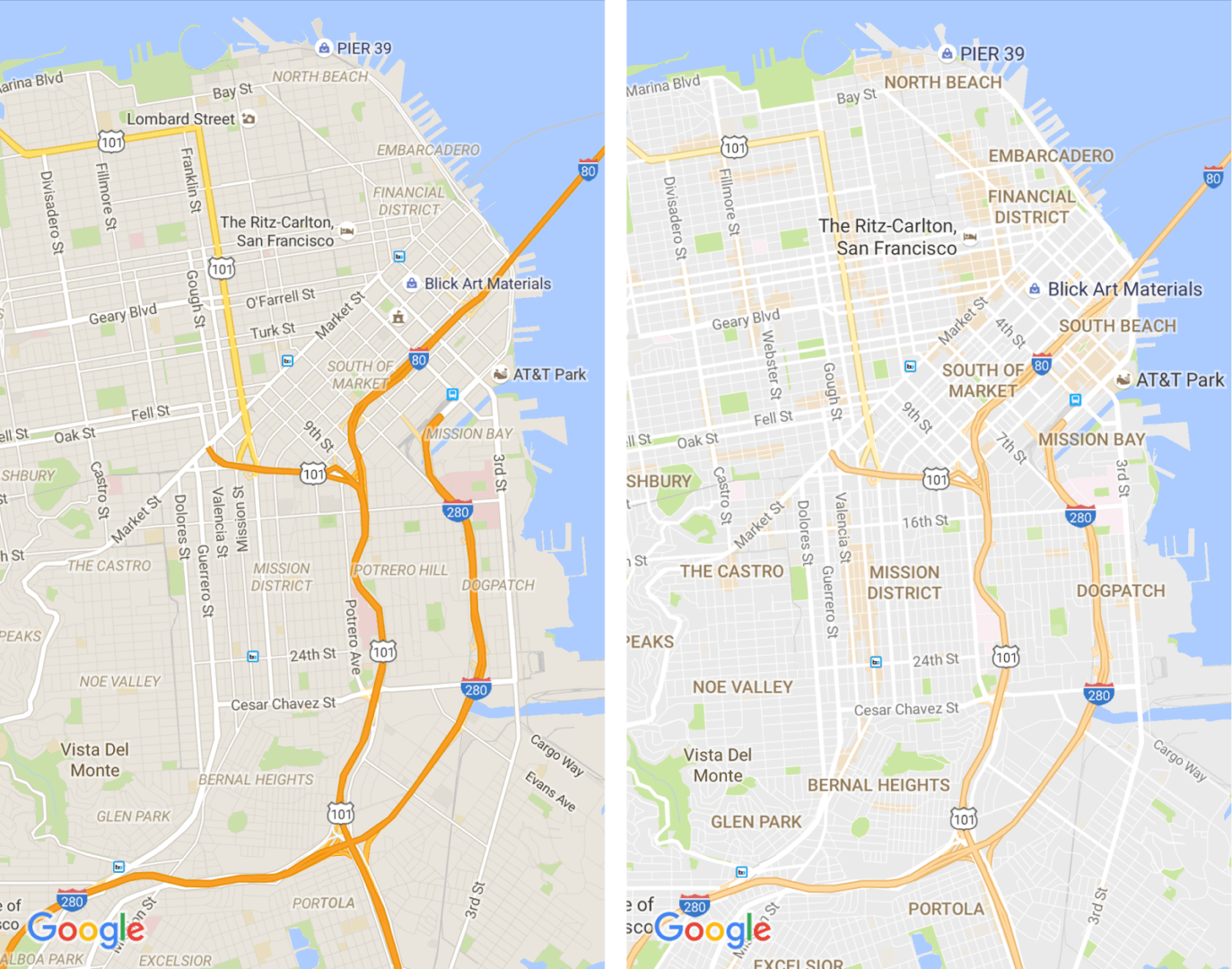
Google tried to declutter the interface by removing elements that “aren’t absolutely required,” such as road outlines. They also updated the typography of street names, points of interest, transit stations and more “to make them more distinguishable from other things on the map,” Google added.
Here is a before and after shot:
Plus, Google Maps has the area of interests highlighted as you zoom into the map. This gives searchers a way to zoom into specific areas that they are more interested in. The highlight is done in an orange shade. Here is a video of how it works:
In addition to that, Google Maps has updated how the business photos and street views imagery viewer works. It is now more of a carousel layout, with a quick way to toggle between normal photos and 360-degree photos. Here is a screen shot of it I captured:

Google also explained that “the new Maps has a subtle color scheme to help you easily differentiate between man-made or natural features, and quickly identify places like hospitals, schools or highways.”
Related stories
About the author