What is a landing page? Build pages that convert
Landing pages drive action. Learn what they are, how they work, and how to design high-converting pages for SEO, ads, email, and more.
Your ad just got clicked. The visitor’s ready to explore.
But instead of taking action, they bounce off the page, and your budget burns.
Why?
Because the page they landed on was the homepage, and it didn’t match what they expected. The headline feels different from the ad they clicked. And the main offer isn’t visible. That’s how, in seconds, they lose interest and leave.
To prevent this, you need a landing page. Designed for a single audience, campaign, or offer, a landing page removes everything that doesn’t move the visitors toward your goal. Instead, it keeps the spotlight on the message that attracted them, making it clear they’re in the right place.
In this guide, we cover what makes a landing page effective, how it differs from your other pages, and the CRO (conversion rate optimization) strategies you can use to get positive results fast.
What is a landing page?
A landing page is a dedicated, standalone web page designed with a singular focus: to persuade visitors to take one specific action. That action could be filling out a form, signing up for a webinar, downloading a resource, starting a free trial, or making a purchase. Unlike broader website pages that serve multiple purposes or audiences, a landing page narrows attention to a single goal.
Every element on the page—from the headline and imagery to the copy and call-to-action (CTA)—is intentionally crafted to support the campaign or offer it’s tied to. By removing distractions like sitewide navigation or unrelated content, a landing page creates a streamlined experience that guides visitors toward conversion.

Good landing pages are not just about design; they’re about alignment. They connect the visitor’s intent (what brought them there) with the business objective (the desired action), often using persuasive techniques such as social proof, urgency, or clear value propositions. In performance marketing, landing pages play a critical role in measuring ROI because they provide a controlled environment to test messaging, offers, and layouts, making them one of the most important tools in digital campaigns.
The difference between a landing page and a homepage or internal page
A homepage is like your brand’s welcome mat. It introduces your company, highlights your products or services, and guides visitors to explore.
Internal pages, such as product or service pages, go deeper into a single offering but still include links, menus, and other navigation options.
But a landing page is different.
It’s stripped down to focus on a single goal, such as capturing leads or driving a sale. Instead of inviting visitors to browse, a landing page channels all their attention toward the action you want them to take.
For example, take a look at Semrush Enterprise’s website homepage.
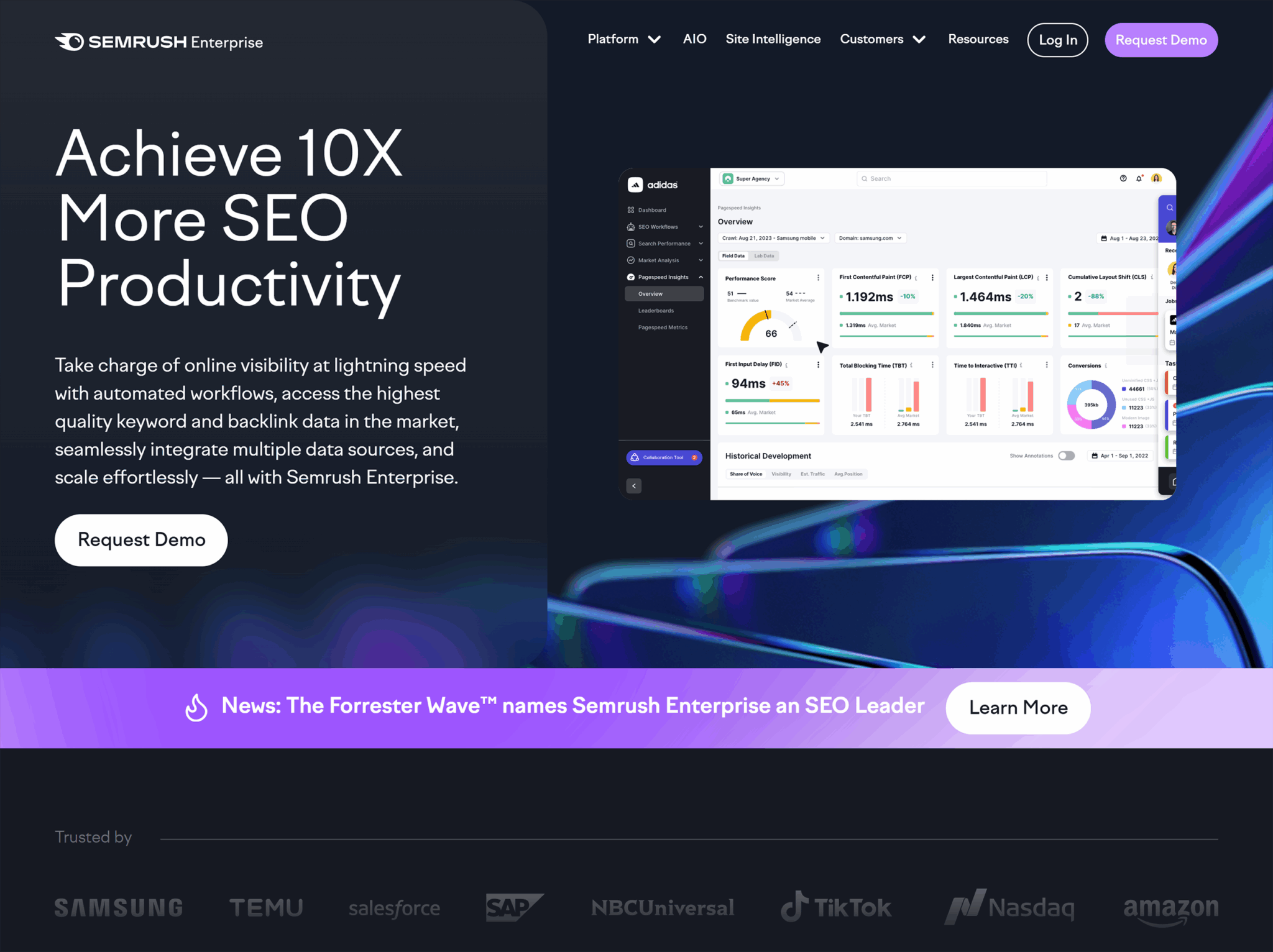
It has a navigation bar with links to multiple pages, a hero banner, a CTA, benefits that the target audience will get, and so much more.
Now look at its landing page about SEO automations.
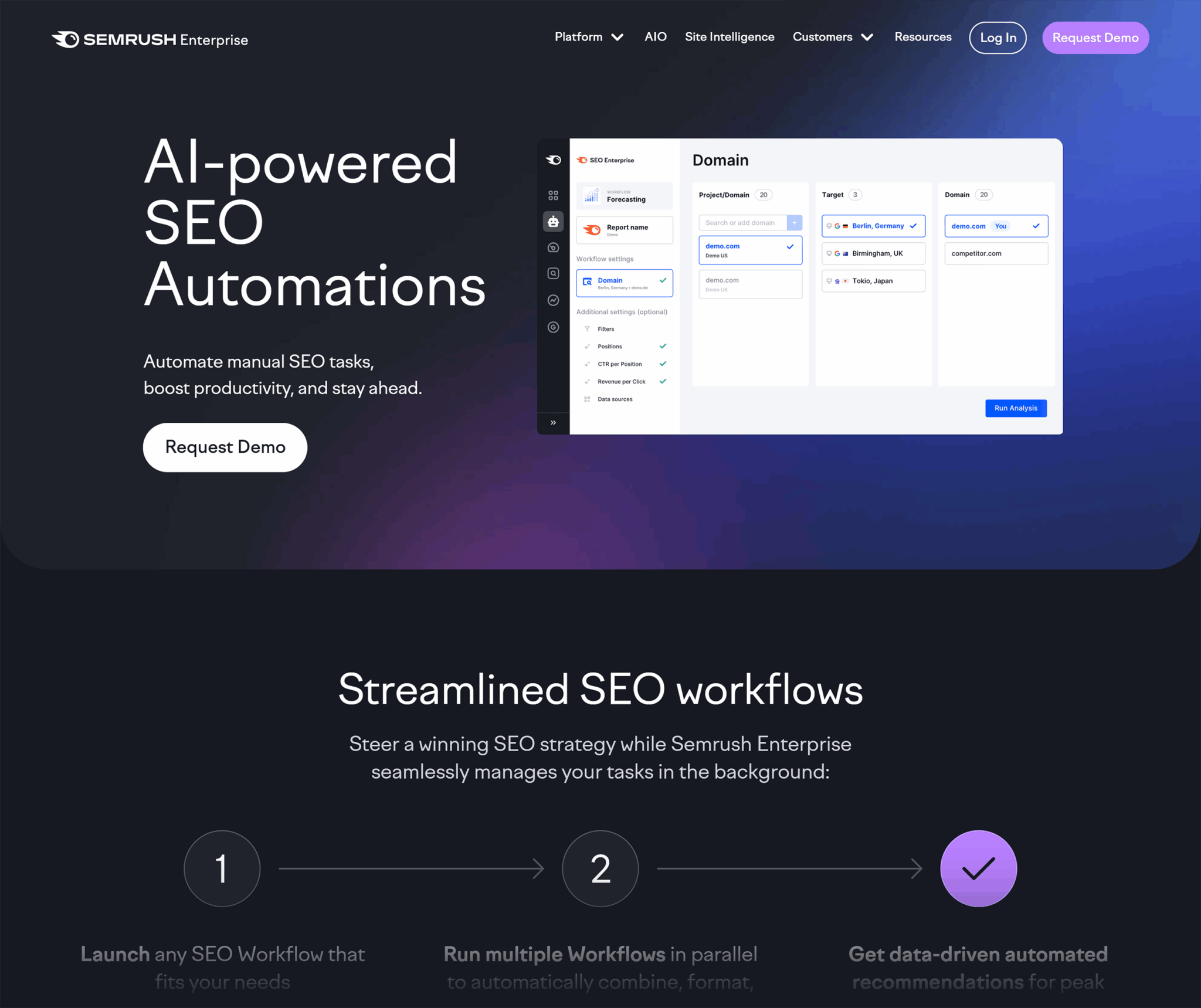
Notice how this landing page focuses on a single solution: AI SEO Automations. Everything on the page is centered around this one offering:
- It explains how enterprises can use this offering to their advantage
- It doesn’t touch on any other solution Semrush provides
That’s what makes it a landing page rather than a homepage. It narrows in on one solution and guides the visitor toward a clear action: requesting a demo.
Should landing pages be indexable?
Pages like your homepage, products page, or services page should always be indexable because they provide evergreen information about your business.
People search for those pages directly (e.g., “[company name] services” or “[bookstore] contact”), so you would want them to appear in search results.
Landing pages, however, are different. Whether or not they should be indexed depends on the purpose of the page.
Some landing pages are worth indexing because they match real searches and can attract organic traffic over the long term.
For example, if you create a landing page for “Book clubs in Boston” or “Historical fiction lovers in Boston,” people searching for those phrases could find that page through Google. That type of location or audience-specific page makes sense to index, because it can serve as an entry point for new visitors.
Other landing pages that are tied to short-term campaigns or paid ads don’t need to show up in search results.
For instance, if you build a page promoting “20% off on all mystery books this week only,” that offer will expire quickly.
If it’s indexed, people might still find it months later, even after the discount has expired. This would give a bad experience, so it’s best not to index such pages.
The SEO toolkit you know, plus the AI visibility data you need.

When to create a dedicated landing page
Not every campaign calls for its own landing page—but when the goal is to move a specific audience toward a specific action like a click-through or a purchase, it’s the smartest move you can make.
Why? Because a dedicated landing page gives you complete control over the user journey:
- Message alignment – You can craft copy, headlines, and imagery that perfectly match the ad, email, or social campaign driving traffic. This consistency reduces friction and builds trust.
- Design focus – Instead of competing with your website’s navigation, blog content, or multiple CTA buttons, a landing page highlights one clear action. Every visual and structural choice supports that action. Your landing page design should focus on conversion optimization, whether supporting your marketing campaigns in lead generation and capturing potential customers or driving paid customers.
- Conversion path clarity – By stripping away distractions, you shorten the decision-making process. The visitor knows exactly what you want them to do, and why.
If your campaign has a clear “one thing” you want the audience to do, it deserves its own landing page.
Let’s look at a couple of scenarios where you should consider making a landing page.
Launching a new product or feature
When you release something new, you want people to focus on it, not get lost browsing the rest of your website.
That’s why it’s best to create a separate landing page for that product. You can point people to this page through an ad or email campaign when promoting the launch.
This way, you’re showing the product or feature front and center, explaining why it matters, and guiding visitors straight to the next step, whether that’s buying or booking a demo.
Unlike a product page, which shows all the available products on your website, a launch landing page can be entirely built around the specific product or feature you want to sell.
Take a look at this iPhone 17 Pro landing page.

It walks visitors through a streamlined user experience centering on the phone’s features and benefits in a super creative style. On top, it has a “Buy” button, which is crystal clear. For quick decision makers, it instantly leads them to the purchase page.
Now compare that to the iPhone product page on Apple’s website.

Instead of spotlighting one phone, it shows the iPhone lineup side by side, with specs, prices, and a comparison option. The goal is to help people explore and decide between models, rather than driving everyone toward purchasing a specific phone.
Running a paid campaign (PPC, paid social)
When you pay for every click, you can’t afford to waste traffic by sending people to a generic page. That’s why a PPC campaign works best when the landing page is built specifically for the ad that brought the visitor there.
For example, when searching for “time management software” on Google, the first result is a sponsored ad. Once you clicked on it, you are taken directly to a standalone page for that exact software, not a general features page or blog.

The headline, benefits, and call-to-action all portrayed the software details directly, making it instantly clear that you are in the right place.
This type of dedicated page removes any distractions and keeps the visitor focused on one explicit action, whether that’s booking a demo or making a purchase.
Targeting a specific audience segment or region
Sometimes your offer clearly communicates what it’s about, but the issue is that you’re not targeting the right audience or location. Because of this disconnect, you may end up getting irrelevant traffic to your landing page.
To overcome this problem, you can create a landing page for a specific audience or location that speaks directly to their needs and priorities.
For example, imagine you run an online bookstore.
Instead of sending everyone to your general homepage, you could build a landing page for fans of a specific genre, like “Historical fiction lovers in Boston.” This page could highlight local author events, books set in Boston, and special offers for nearby customers.
You could then drive the target audience group to the page with a dedicated paid ad or email campaign. For instance, you might run ads that only appear to people in Boston who search for historical fiction, or send an email to customers who’ve bought similar books before.
When visitors see content that speaks directly to their interests or community, they’re far more likely to engage and convert.
Promoting an ebook, whitepaper, or lead magnet
If you want people to download a resource, the page they land on should focus only on the value of that resource and how to get it.
A landing page does exactly that.
Instead of burying the offer in a blog post or sidebar, you can use a dedicated page to highlight what’s inside, who it’s for, and how it will help.
The headline can promise the main benefit, the bullet points can outline key takeaways, and the call-to-action (CTA) can make downloading feel like the obvious next step.
Take this playbook landing page by Matt Barker for example.
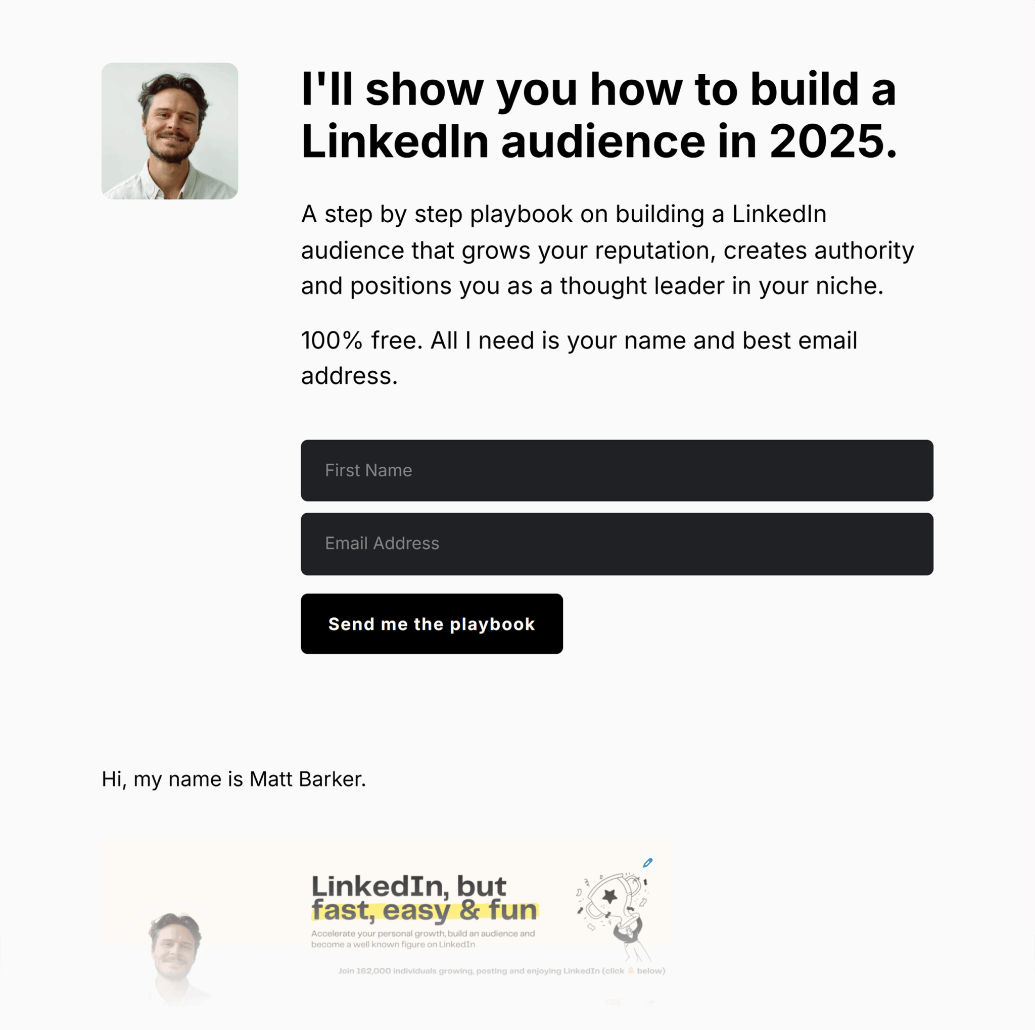
It focuses on the problem the ebook solves, shows what the visitor is going to get in the ebook, and keeps the form front and center so it’s easy to download.
SEO-focused local campaigns
If you’re targeting search traffic for specific locations, niches, or keywords, a dedicated landing page can help you rank higher and convert better.
For local SEO, you can create separate pages for each city or neighborhood you serve. Each page can include location-specific keywords, local testimonials, and maps. This strategy makes the pages more relevant to searchers and more likely to show up in their results.
Marriott, one of the world’s largest hospitality companies, creates separate pages for each of its hotel locations, like “Islamabad Marriott Hotel” or “Karachi Marriott Hotel.”
This way, travelers searching in those cities land on a page tailored to their destination, which makes the experience more relevant and increases the chances they’ll book a room.
This is at the crux of local lead generation and lead capture. Dedicated landing pages give you the ability to design forms, offers, and calls-to-action that match the intent of each audience segment. A visitor who comes in through a campaign for “enterprise IT solutions” will convert at a higher rate if the landing page speaks directly to enterprise challenges—paired with a gated whitepaper or demo request form—rather than being sent to a generic homepage. Similarly, a visitor searching “webinar on local SEO strategies” is far more likely to register when the landing page is focused solely on that webinar, with clear value props and a simple sign-up form.
By tailoring each page to the searcher’s intent and aligning it with a single lead capture mechanism, you remove friction and increase the odds that a click turns into a qualified lead.
Programmatic campaigns
Programmatic campaigns use automated technology to buy and place digital ads in real time. Instead of manually choosing where ads appear, programmatic technology decides which ad to show to which person, based on their data, location, or interests.
Because these ads are so targeted, you should create a dedicated landing page to ensure the message in the ad matches what visitors see. This builds trust—when people click an ad and immediately find exactly what was promised, they feel confident your brand delivers on its word.
For example, imagine your demo bookstore runs a programmatic ad promoting “20% Off Mystery Novels” to readers who’ve shown interest in that genre.
If someone clicks and ends up on a generic page with every category—romance, children’s books, bestsellers—they’ll have to search again for the mystery section, and many will give up.
But if the ad takes them straight to a landing page featuring the exact mystery novels on sale with the discount clearly shown, they’ll immediately see the promise delivered.
That simple alignment builds trust and makes them much more likely to buy.
Event registration or limited-time offers
When you’re promoting something with a deadline like a conference, webinar, or seasonal sale, you can’t afford visitors getting distracted. If someone clicks your ad and lands on a general page, they might miss the registration button or never see the countdown to the offer’s end.
That’s why creating a separate landing page is the best possible option here.
Instead of sending people to a general homepage or about page, you can use a single, purpose-built page to share the details and make registration or purchase as simple as possible.
Take a look at this landing page by Moz for their MozCon 2025.

It shows the event details upfront and keeps the registration CTAs visible.
Why landing pages matter in modern digital strategy
Every click you earn is an investment, whether it’s from ads, search, or social. If you send that traffic to a generic homepage, you may lose potential leads before they take action. But a focused landing page speaks directly to the visitor’s intent and guides them toward your measurable goal.
Let’s take a closer look to understand why landing pages are so important.
Focused messaging = better conversions
The more closely your page matches what a visitor is looking for, the more likely they are to take the next step, like filling out a form to get a free consultation or clicking “Buy Now” to grab a limited-time deal.
On a homepage, you might be juggling multiple priorities: introducing your brand, showing your latest products, and linking to your blog.
But with a landing page, you can deliver one clear message that connects directly to the ad, email, or search result that brought the visitor there.
That’s why it works so well: every headline, image, and button is chosen with one goal in mind.
This tight focus builds trust. Because when people see exactly what they expected, they’re less likely to click away and more likely to convert, whether that means buying, signing up, or downloading.
Landing pages are critical for SEO, paid media, email, and affiliate funnels
You can use landing pages in almost every channel you market through, including search, paid ads, email, or even affiliate promotions.
Here’s how they work in each:
- For SEO, a landing page can target a specific keyword or location, making it easier to rank in search results and attract the right visitors
- For paid campaigns, it ensures the ad click leads to a page that matches exactly what was advertised
- For email marketing, it gives subscribers a direct, distraction-free path to your offer instead of sending them to a generic homepage
- For affiliate marketing, it gives partners a focused, trackable page that’s built to convert the traffic they send
If every marketing channel (like SEO, paid ads, email, affiliates) sends people to its own landing page, then:
- Visitors know exactly what to do: The page matches the ad, email, or link they clicked, so it’s easier for them to take the action you want
- You can track results more clearly: Because each channel has its own page, you can see exactly how many visitors and conversions came from that channel
Landing pages enable precise measurement of campaign performance
When all the traffic for a campaign goes to the same landing page, you can easily see how well that campaign is performing. You’ll know how many people visited, where they came from, and how many took the action you wanted, like buying a product or registering for an event.
But if you send people to a homepage instead, that data gets messy.
Why?
Because the homepage collects visitors from everywhere: organic search, direct traffic, and social media. That’s why it’s hard to tell which visits came from your campaign and which didn’t.
Suppose you’re running a Google Ads campaign for a “summer sale on books.”
If your ad clicks go to a dedicated “summer sale on books” landing page, every visit to that page is from the ad. You can see exactly how many clicks turned into purchases, and calculate your return on ad spend (ROAS) without guesswork.
This clean data tells you precisely how well your campaign is performing so you can make smarter decisions and prove your results with confidence.
Landing pages are a key component of A/B testing
A/B testing is a method used in CRO to see which version of a page drives better results, like higher conversion rates, more clicks, or greater engagement.
Here’s what that means:
You create two versions of the same page: Version A and Version B.
Change only one element between them (or make any other slight difference), then split your traffic so each version gets visitors. Compare the results to see which version performs best.
Landing pages are perfect for A/B testing because they have a single, clear goal. When you A/B test them, it becomes easier to isolate changes and measure their impact without interference from extra links or distractions.
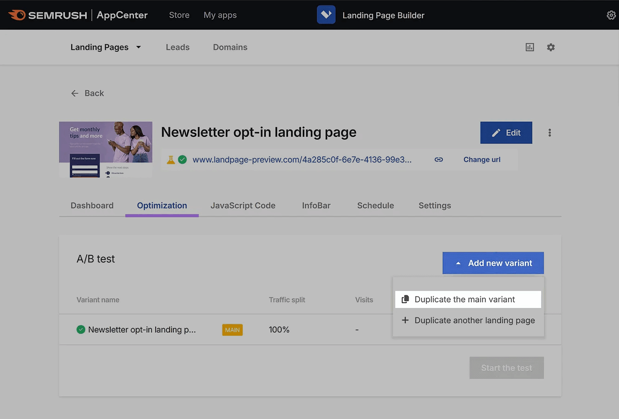
You can do this with tools like Semrush’s Landing Page Builder, Unbounce, or Optimizely.
Let’s see how you can run an A/B test using Semrush:
- Open the “Landing Page Builder” app and click “Create your first landing page”

- Choose a template that fits your campaign or start with a blank page
- Give your landing page a name and click “Start editing”

- Use the drag-and-drop editor to customize your page. Update elements like headlines, images, and the meta description.
- When ready, click “Publish”
- After publishing, you’ll receive a test domain or can connect the page to your domain
- In your landing page dashboard, go to “Optimization” and click “Add new variant” > “Duplicate the main variant”
- Edit this variant by changing one element you want to test (e.g., a call-to-action button or headline)
- Click “Start the test”—Semrush will automatically split your traffic between the two versions and track visits, leads, and conversions
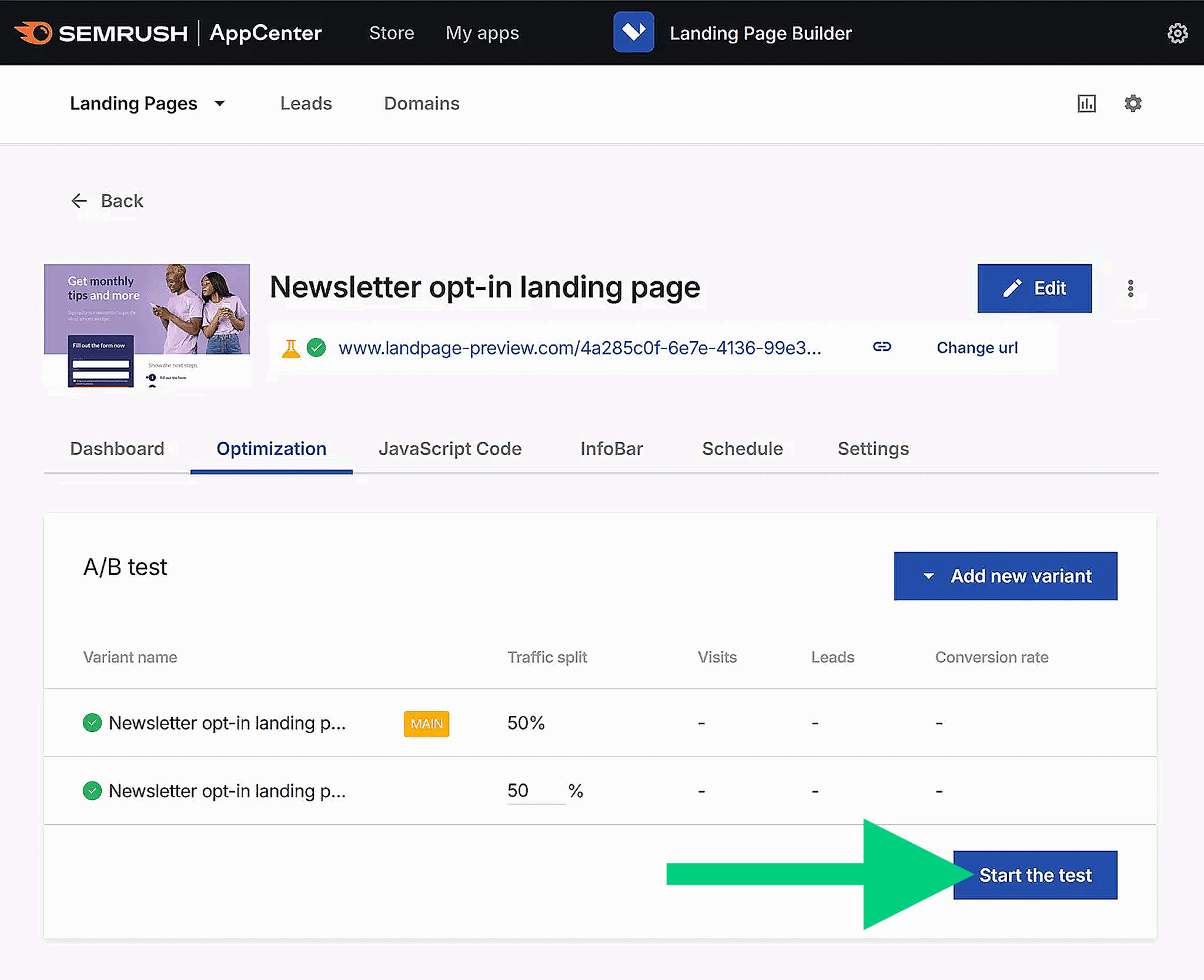
Let the test run until you have enough data to see a clear winner (often at least a few weeks). Once the test is complete, stop the test and keep the winning version (the one that performed better).
Landing pages help match intent across multiple channels
When someone clicks your ad, email, or search result, they already have an expectation of what they’ll see next. If your landing page delivers exactly what they expected, they’re more likely to stay and convert.
This is called “matching intent,” and it’s one of the biggest advantages of using dedicated landing pages.
- For SEO, that means the page content should directly answer the query that brought the visitor there
- For PPC, the headline and offer should mirror the ad copy they clicked
- For social, the design and message should feel like a continuation of the post or story that grabbed their attention
- For email campaigns, the landing page should carry through the same promise or offer as the subject line and body copy
When you align the experience across channels, visitors don’t have to think about whether they’re in the right place; they just focus on taking the next step.
For example, if your Facebook ad promises “Free shipping on all weekend orders,” the landing page should show that offer in the headline and keep the “Shop now” button visible without scrolling.
Any mismatch could confuse visitors, and they may leave.
Landing page vs. homepage vs. product page vs. service page
Not every page on your website serves the same purpose:
- A homepage welcomes visitors and helps them explore
- Product and service pages give details about specific offerings
- A landing page is built for a single, focused action
Let’s understand the differences so you can decide which type of page will get you the best results for a campaign.

Use cases for landing pages, homepages, product pages, and service pages
Each type of page plays a different role in your website’s overall strategy. But choosing the right one depends on your goal and the visitor’s intent. If you send the wrong type of traffic to the wrong type of page, you may miss a lot of good opportunities to convert your leads.
Let’s again use the bookstore example to see how each page type fits into real campaigns.
Landing page
Imagine you’re running a PPC ad for “Buy 2, Get 1 Free on Mystery Novels.”
The ad should direct users to a landing page designed specifically for that promotion, with the deal prominently featured and a clear way to claim it. Don’t add navigation to other genres or books. Instead, focus on one clear goal: getting the visitor to take the offer.
Homepage
The homepage is the bookstore’s welcome door.
It introduces your shop, displays different categories like fiction, non-fiction, and children’s books, and points people toward events, memberships, or seasonal picks.
Someone who hears about your store through a friend or searches your brand name would start here to explore everything you offer.
Products page
The products page gives visitors an overview of the products a company offers.
For a bookstore’s website, this could be a page that displays different book categories such as mystery, romance, and non-fiction, with links to explore books within each category. The goal here is to inform and help you explore, rather than locking you into one specific book.
From there, visitors can click into a product’s detail page, which provides all the information someone might need when comparing options—such as the book’s cover image, synopsis, author bio, price, availability (hardcover, paperback, ebook), reader reviews, and a section recommending similar titles.
All of this information is designed to educate and help shoppers decide whether this is the right book for them.
A landing page, on the other hand, takes a much more focused and persuasive approach.
While it may still include details about the product, those details are framed to:
- address customer pain points
- focus on benefits more than features
- show social proof like testimonials
- create urgency through limited-time offers
Services page
The services page works similarly, but for services. Instead of focusing on one service or package, it provides an overview of the services the company offers.
In our bookstore example, the services page may include hosting book clubs, customizing book orders, organizing on-demand book events, and any other services.
From there, visitors can click into a service detail page, which goes deeper into what a specific service includes—for example, outlining the process, pricing, scope, or client testimonials.
These pages are meant to educate and help people compare different service options before deciding which one best fits their needs.
A landing page, on the other hand, is much more focused and persuasive. While it may still describe the service, the copy is framed to:
- speak directly to customer challenges and how the service solves them
- emphasize benefits and outcomes rather than process details
- include proof of value, such as client stories or success metrics
- build urgency through limited availability or calls to act now
Why most homepages don’t convert (and shouldn’t try to)
A homepage has a big job to do: it needs to welcome visitors, explain who you are, and show them different paths to explore. That’s why it’s not built to push one specific action.
Think about our bookstore example.
The homepage might feature multiple categories—fiction, non-fiction, children’s books—alongside event announcements, loyalty program details, and staff picks. This variety is excellent for browsing, but it also means the visitor’s attention is divided.
If your goal is to get people to act on a single promotion, like “Buy 2, Get 1 Free on Mystery Novels,” the homepage works against you. The offer would have to compete with everything else on the page, like other genres and general store information.
That’s why dedicated landing pages exist.
They keep the message laser-focused and guide visitors straight to the action you want, without the temptation to wander off into other sections of your website.
CRO principles for optimizing landing pages
Once you have a landing page in place, the next step is making sure it converts as many visitors as possible.
This is where CRO comes in.
Conversion rate optimization is the process of improving a page so a higher percentage of people take the action you want, whether that’s making a purchase, signing up, or downloading a resource.

Let’s look at some proven CRO principles you can apply right away.
Match the message between ad/email and the landing page
When someone clicks an ad or link in your email, they expect the landing page to look and feel like a natural continuation of that message.
Take a look at this example from Atlassian.
The headline of the advertisement reads: “Project Management Made Easy with Jira + Confluence” That headline creates a promise of simplicity and teamwork.
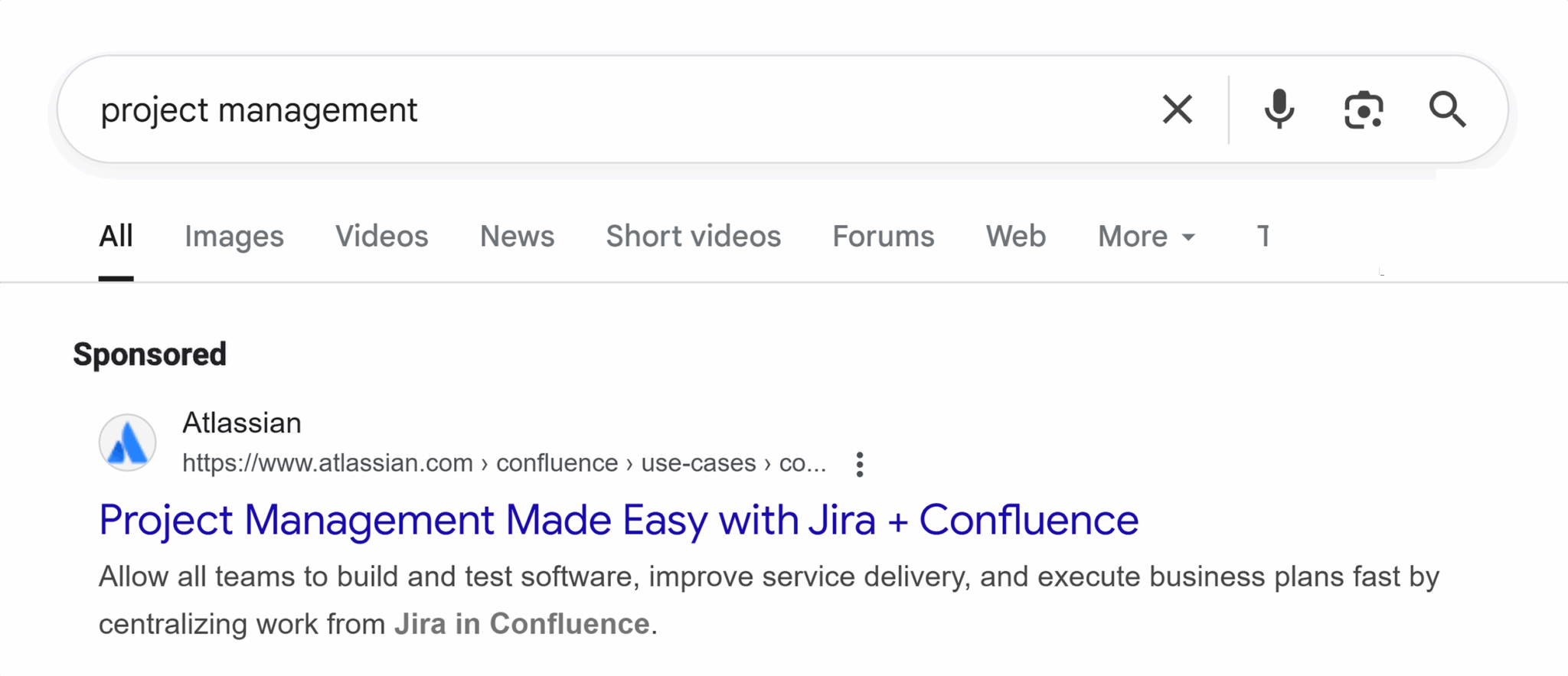
When you click the ad, the landing page opens with the same primary H1: “Project management made easy.” The message stays consistent, and the page design reinforces the same idea.
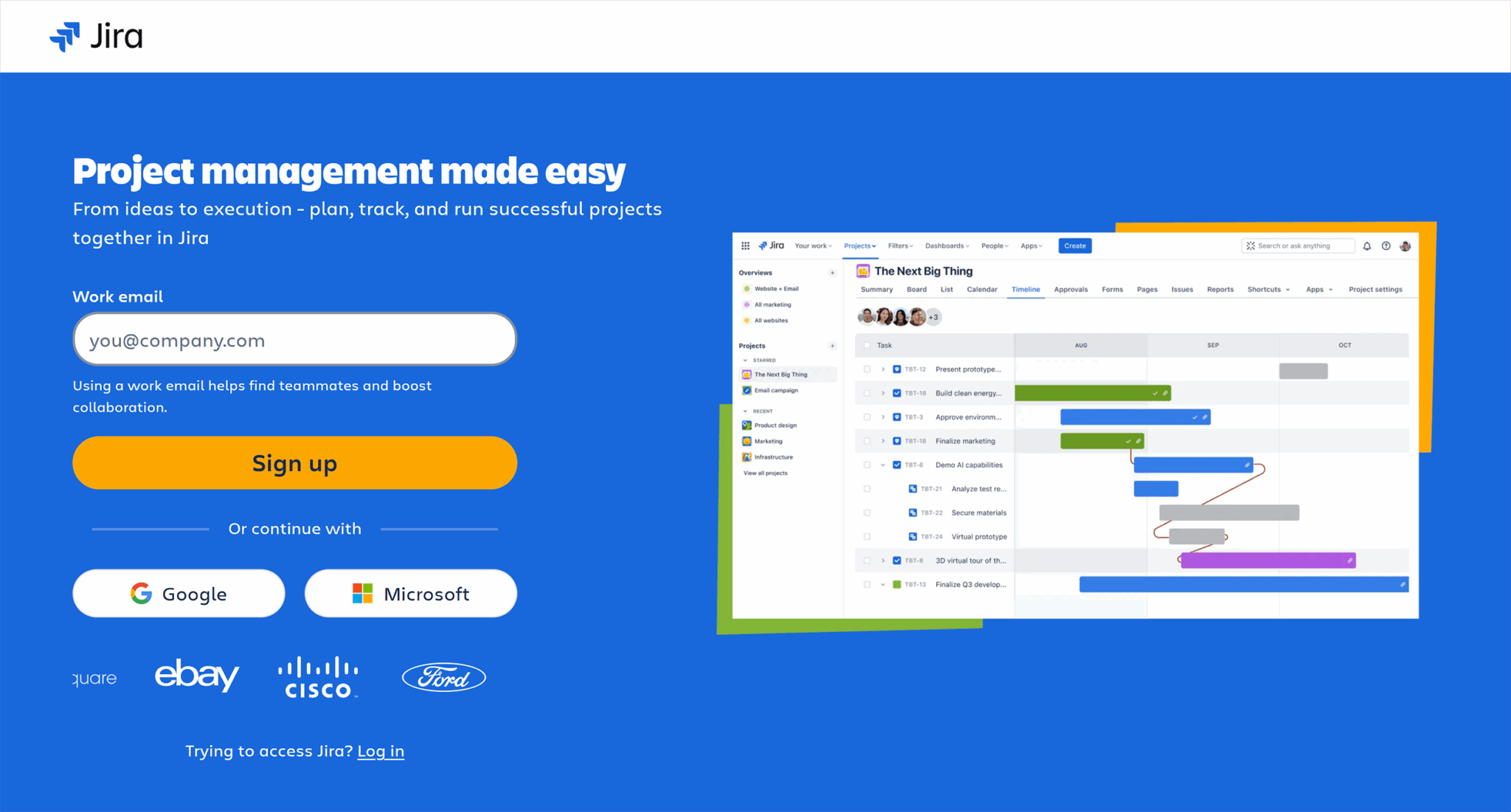
Now, because the ad and the landing page match, visitors feel confident they’re in the right place, which makes them more likely to continue exploring.
This consistency also builds trust because your brand is delivering on the promise it made in the ad. Over time, that trust creates a happier customer base because when people get what they expect, they’re more likely to stay longer and explore your page.
That extra time on the website also signals to Google that visitors find value in your content, which can help your website perform better in search results.
But if there’s a disconnect between the ad and the landing page—different wording, a changed offer, or even a new color scheme—it can cause confusion and make the visitor hesitate.
Use visual hierarchy and scannable copy
People don’t read landing pages like books—they scan.
Their eyes jump to headlines, buttons, and images first, and only then do they decide whether to read more.
That’s why the way you structure your page matters as much as the words you use.
Visual hierarchy means arranging elements so the most important things stand out first:
- The H1 should stand out stylistically and feature noticeably larger, more prominent text (e.g., bigger and bolder). It should also include the core keywords that represent your page.
- Calls-to-action should be clear and visually distinct
- Supporting text should be broken into short paragraphs or bullet points
In our bookstore example, the “Buy 2, Get 1 Free” H1 might be the largest text on the page, placed right above an eye-catching banner of mystery book covers. The “Shop now” button would be a contrasting color so it pops, while extra details about the promotion appear below in short, scannable lines like this:

By guiding the visitor’s attention this way, you make it easy for them to understand the offer and act on it without feeling overwhelmed by blocks of text or clutter.
Reduce form fields to essentials
The more effort it takes to complete a form, the more likely visitors are to abandon it. Because every extra field, whether it’s phone number, company name, or address, adds friction and gives people another reason to click away.
If you only need an email address to deliver a lead magnet, don’t ask for anything else. You can always collect more information later once the person has shown interest.
For our bookstore example, imagine you’re offering a free “Mystery Novel Reading Guide” in exchange for a sign-up.
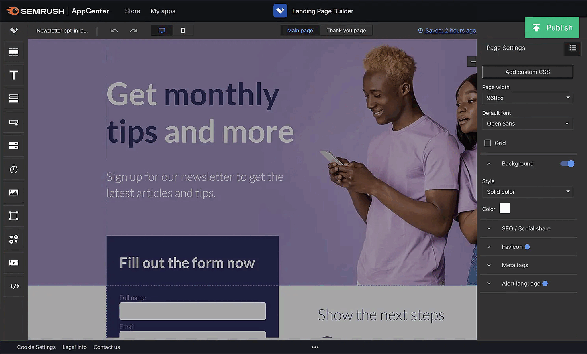
If your form only asks for a name and email, readers can grab the guide in seconds, as shown in this image promoting a newsletter subscription.

But if you also require a phone number, birthday, and favorite genre, many will decide it’s not worth the hassle. And that’s how you’ll lose potential leads.
Eliminate distractions where appropriate
Every extra link on a landing page is a possible exit point.
If visitors can click away to another page before taking the action you want, many of them will. That’s why high-converting landing pages often remove navigation menus, footers, and sidebars—anything that isn’t directly tied to the offer.
If your goal is to get people to claim the “Buy 2, Get 1 Free on Mystery Novels” deal, the landing page shouldn’t include links to children’s books, author events, or your blog. Those things are valuable elsewhere on your site, but here, they compete for attention.
Strip the page down to only the essential elements: headline, offer details, visuals, and a clear call-to-action.
You can also include any legal details or restrictions in small “fine print” at the bottom of the page. For example, you may add a note that the “Buy 2, Get 1 Free” offer applies only to paperback mystery novels, or that the promotion ends on a specific date.
This way, the information is clear without pulling focus from the main offer.
Use A/B testing to test one variable at a time
A/B testing lets you see which version of your landing page works better, but to get meaningful results, you need to change only one element at a time.
If you test a new headline and a different image in the same experiment, you won’t know which change made the difference.

For example, our demo bookstore team could test two versions of the “Buy 2, Get 1 Free on Mystery Novels” landing page.
- In Version A, the headline says “Mystery Lovers’ Weekend Sale”
- In Version B, it says “Buy 2 Mystery Novels, Get 1 Free (This Weekend Only)”
Everything else, including the images, layout, and call-to-action button, stays the same.
By isolating the headline, you can see whether the more specific wording drives more sales. Once you find a winner, you can move on to testing another element, like the button color or hero image, using the same process.
Expedite meaningful variation via AI-powered landing page design
AI-powered landing page design uses data and machine learning to automatically optimize landing page templates, headline and body copy, calls-to-action, and even form placement for higher conversion rates.
Instead of relying on guesswork, AI tools analyze user behavior, traffic sources, and engagement patterns to deliver high-quality, personalized experiences that resonate with each visitor segment.
For example, AI can test thousands of headline variations and generate different versions of landing pages, recommend the ideal length of a lead capture form, or dynamically adjust page elements based on device and location. This approach not only saves time but also ensures continuous improvement—helping marketers increase lead generation, lower acquisition costs, and maximize ROI from their campaigns.
Use heatmaps or session recordings to diagnose issues
Sometimes, the best way to improve a landing page is to see exactly how visitors interact with it.
Heatmaps help with this. They show where people click, how far they scroll, and which areas get the most attention.
But session recordings go a step further. They let you watch real visitor journeys in action.
You can create such heatmaps and monitor session recordings using tools like Hotjar, Contentsquare, or Crazy Egg.
Let’s see how to make one using Hotjar.
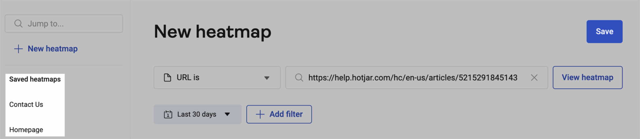
- Click “Heatmaps” in the left-hand menu > click “New heatmap”

- In the URL filter dropdown, choose how you want Hotjar to match your URL:
- “URL is” (default) shows data from a specific page, ignoring parameters
- “URL is exactly” matches the full exact URL, including protocol and query strings
- Other options include “URL contains,” “URL starts with,” or regex matching if needed

- Start typing your URL and select from the suggested pages, then click “Continue”

- Choose your heatmap goal to help Hotjar optimize map type and overlay (e.g., click map, scroll depth, rage clicks)
- Select a screenshot from the available previews or click “Take new screenshot” to grab a fresh one
- Once the screenshot loads, use the filters in the side panel to:
- Switch between device types (desktop, tablet, mobile)
- Change the heatmap type (clicks, scrolls, movement)
- Apply overlays for deeper insights
- Click “View recordings” to see session replays tied to your filters (if available)
- Click “Download” if you want to save the heatmap as a PNG or download raw data as a CSV
- To revisit the heatmap later, click “Save” (this stores the map along with all your applied filters)
A heatmap of the “Buy 2, Get 1 Free on Mystery Novels” landing page might reveal that most people never scroll past the featured book images. This means the detailed offer terms at the bottom are going unseen.
Likewise, a session recording might show visitors hesitating at the checkout form because the “Apply Offer” button isn’t immediately apparent.
These insights help you identify friction points and make targeted changes, whether that’s moving important details higher on the page or making buttons more visible.
Track, optimize, and win in Google and AI search from one platform.
Launch a focused landing page this week
If you haven’t built a landing page yet or if you already have a few but haven’t tried optimizing them, now’s the perfect time to take what you’ve learned here and implement it.
Keep the goal simple, whether it’s to make a sale, collect an email signup, or get event registrations. Then, build everything on the page around that single action. Mirror the exact offer and wording from your ad or email, remove any navigation that could pull people away, and make the call-to-action impossible to miss.
If you want to learn how to see exactly where your sales or signups are coming from, check out our Google Analytics 4 attribution guide. It explains how GA4 gives credit to different marketing touchpoints.