How Common Are SEO Problems With Responsive Web Design?
It seems people have strong feelings for or against responsive Web design. My thanks to those with open minds who responded to last month’s column on SEO problems with responsive Web design with either praise or reasonable criticism. While I answered the most common criticisms already, one recent comment from Google’s John Mueller stood out to me. […]
It seems people have strong feelings for or against responsive Web design. My thanks to those with open minds who responded to last month’s column on SEO problems with responsive Web design with either praise or reasonable criticism. While I answered the most common criticisms already, one recent comment from Google’s John Mueller stood out to me.
When he posted Luke Wroblewski’s results of sites that have seen success with responsive Web design to Google+ with the caption #rwd #ftw, I wanted to remind Google and other responsive Web design advocates that responsive Web design, while great for some sites, is not the right solution for others.
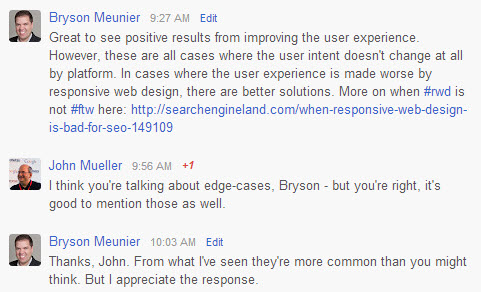
This was great feedback to get, as I tried to get an official response from Google to the post last month, and this acknowledgement from a Google representative is at least some indicator that responsive Web design can have problems for the user and isn’t the right solution in all cases.
So, are these extreme examples that don’t apply to the majority of sites in question, as John Mueller says, and many responsive Web design advocates seem to think? Let’s look at the data by issue and see.
Unfortunately for SEOs and site owners, there’s not an exhaustive list of sites whose information architecture does not match their consumer demand somewhere to easily prove if this holds true.
Instead, for the next two proofs, I’m going to use three examples from .Net magazine’s list of the top 25 responsive web sites of 2012: Starbucks.com, Microsoft.com and Disney.com. If these sites that are held as paragons of future-friendly Web design have these issues, this should at least demonstrate that these are not edge cases, but less extreme problems that we need to address today.
1. Many Top Responsive Sites Have Poor Information Architecture
Last month I referenced an audit that I did of Mercedes’ mobile site in which the traditional website had site architecture issues that prevented the transcoded pages from appearing in mobile search results, as well. Because the same content is used in responsive Web design, these problems would exist with retrofit responsive sites. Microsoft, Disney and Starbucks all have IA issues that their responsive redesign (or retrofit, in most cases) didn’t solve.
For example, Starbucks did a great job of highlighting the local aspect of their website, as search data shows the great majority of users are looking for a store, especially if they’re using the site on a mobile device.

Starbucks does a nice job at highlighting the Store Locator given their users’ tendency to search for a store near them, but their information architecture has other problems when it comes to searchers.
The rest of the website is not as friendly to searchers and users, however. You can see from the data below that the priority based on search volume is not aligned with the prominence of each feature on the mobile site.
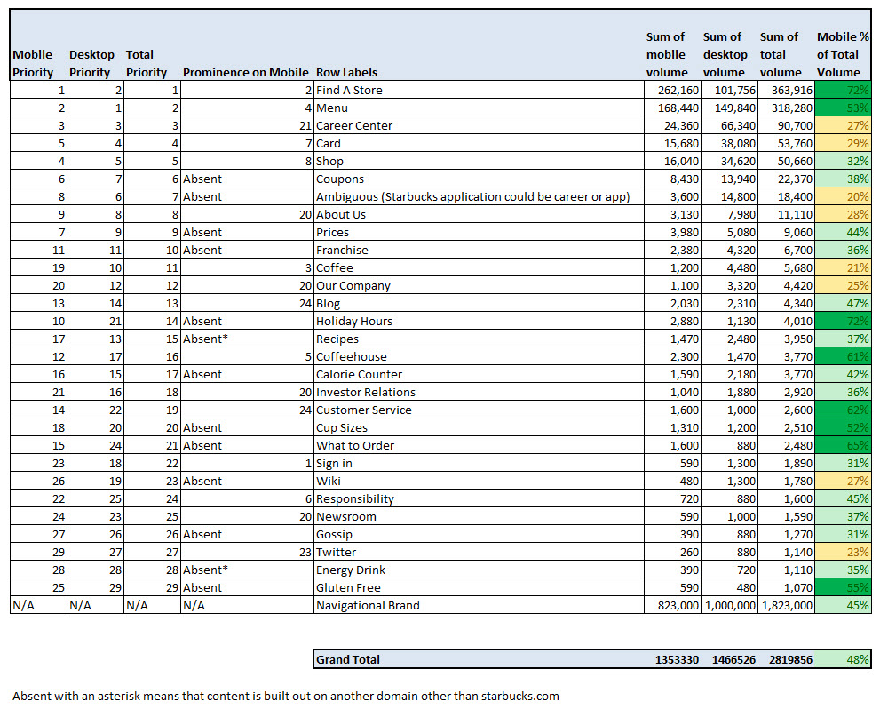
Comparing Starbucks responsive site architecture to searcher interest reveals potentially profitable gaps.
I’ve explained the methodology of this chart in detail earlier at Marketing Land, but what I’ve basically done here is categorize branded keywords where the total volume is 1,000 or more searches per month and compare them with the features on the site.
Sometimes, the search intent is aligned closely with the prominence on the website, but in many cases, it’s not. For example, coupons are absent from the home page, but you can find expired ones through search. And, more people are looking for Starbucks jobs than are looking for anything around the brand except stores and coupons. Yet, the feature is buried at the bottom of the page. These may have been features that Starbucks chose to suppress for business reasons, as search volume can’t be the only driving factor when considering what goes on a site, but for features like calorie counters and order recommendations, this doesn’t seem likely.
As I said in the last column, these problems could be fixed with a complete redesign, responsive or not, but the point is that responsive sites can and often do have major information architecture issues that will prevent them from being visible in search engines. So, if you’re saying “responsive sites are better for SEO,” as many do, and your responsive site has major information architecture issues, what are you really saying?
I haven’t done the same exercise for Microsoft or Disney, but it’s clear that they also have issues when it comes to aligning search behavior to information architecture.
Disney, for example, has major problems when it comes to the concept of games. We know from a recent investor event that games are important to Disney’s business, but it’s hard to tell from looking at their site. A searcher entering [disney games] in a search engine will go to this page, where they are compelled to play games like Mickey Delivery Dash, or Phineas and Ferb:

Disney’s responsive site entices mobile users to play a game that they have no chance of playing.
However, when they try to play the game that they’re told by the graphic to play, this happens:

For a site to be responsive, it should work everywhere. Not so for this critically-acclaimed responsive site.
And sometimes even this happens:

Sometimes responsive sites provide less than responsive user experiences.
When you return to the Games page and click on Online Games in the footer, it redirects you to the top of the page; and when you click on Video Games in the footer, this happens:

Our quest to play games on a responsive site ends with this, as would quests from the majority of mobile searchers.
I can’t play video games on my phone now?
This is an award-winning, future-friendly site, but if you were one of the people who did one of the 30,000 searches a month from a mobile device on Google, Bing or Yahoo! on [Disney games], you’re probably not going to think it’s that great. And you’re certainly not going to think of it as being responsive to your needs regardless of what platform you happen to be using.
Microsoft has a similar situation if you navigate to Downloads on their site. Very popular category, but don’t be misled into thinking you can actually download anything if you click there. If you can figure out that the three lines and three dots in the upper right-hand corner is a menu, you get a category with downloads like this:

Microsoft’s responsive web site offers free downloads to mobile searchers that mobile searchers can never receive.
Windows downloads weren’t relevant to my Android phone, so I clicked on Free downloads and was taken here:

This page was presented when I clicked on Free downloads in my mobile web browser, not my PC.
Get the most out of my PC? What PC? I thought I was supposed to be getting some free downloads, and that this site was responsive to my needs. Again, a poor user experience and content that’s platform-specific and not labeled as such is not good for the searcher experience, and not good for SEO.
So, I profiled three large business websites that have gone responsive and found problems with all three, which tells me these information architecture problems in responsive sites are probably more common than some people think.
And, for those of you who still say responsive Web design is best for SEO, this is award-winning responsive Web design, and nothing about it is good for the searcher experience, or SEO.
2. Many Top Responsive Websites Don’t Use Mobile-Specific Keywords
Not everyone understands how to use the new keywords that searchers are putting in mobile devices to their advantage, and that’s fine. It’s a relatively new phenomenon that some of us are finding success with, but not everyone’s there yet. I’ve written a pretty extensive guide for those of you who may be new to the subject.
Those who do understand this may see the same opportunities that I do when I look at Starbucks’ keywords that come primarily from mobile devices. When we sort our master keyword list by mobile percent of total volume and look at those keywords where more than 70% of the total volume comes from mobile devices, we see a lot of people en route to a Starbucks.
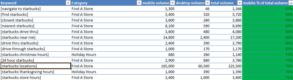
Amazingly 46 people a month ask their desktop computer to help navigate them to a Starbucks.
Many local businesses say that most of their revenue comes from driving a lead to a store, and so, these keywords that indicate a searcher’s intent to go to a physical Starbucks location are probably some of the most valuable leads that the website gets. But, with responsive design, the opportunity is squandered.
Many of these searches lead to Google pages to specific directions, and the website will never get credit for the lead. In cases where directions don’t show up, such as [drive thru starbucks]:

Some queries with local intent don’t include maps in mobile results.
Or worse, when incorrect information shows up, such as [24 hour starbucks] (I’m in Chicago):

Not going to walk to San Francisco from Chicago for a latte, Google.
Starbucks has the opportunity to provide a better user experience to people who are looking for these things, and to get a valuable website lead in the process.
How do we do this? How about a crawlable page that lists all 24 hour Starbucks locations and another that lists all locations with drive thrus? Right now, there is no page like that because the site relies on search filters, which aren’t crawlable (see problem #1 above). If we created that page and used HTML5 to tap into the phone’s GPS, we could provide them with the nearest location of these types as soon as they clicked through to the page.
As it is, it sends a searcher to the Store Locator page, where the searcher will hopefully recognize the small funnel shape is a filter icon, and then click on it. When that happens, you can select the type of Starbucks that you’re interested in, and then click Apply. When that happens, you go back to a map, where you need to zoom in or hit the scope button to find your location, and hopefully it shows the location nearest you.
But why would Starbucks want to make their most valuable leads go through that experience when they could show them what they’re looking for with one click? They might be able to do this with a responsive design, but it’s kind of unlikely that anyone would, since advocates so often argue against the mobile context and wouldn’t be looking for opportunities like this in the first place. Smart SEOs can avoid the same mistakes and get more converting traffic from natural search in the process.
Disney also has keywords like this in mobile content like games, apps and wallpaper. They do have their mobile apps listed on their site, but as we saw above, the keyword “mobile games” isn’t mentioned, and they don’t list mobile wallpaper or have wallpaper on their responsive website, it seems. This is a big miss for SEO, as there are thousands of searches for games and wallpaper, and Disney won’t get any of them with this “responsive” site.
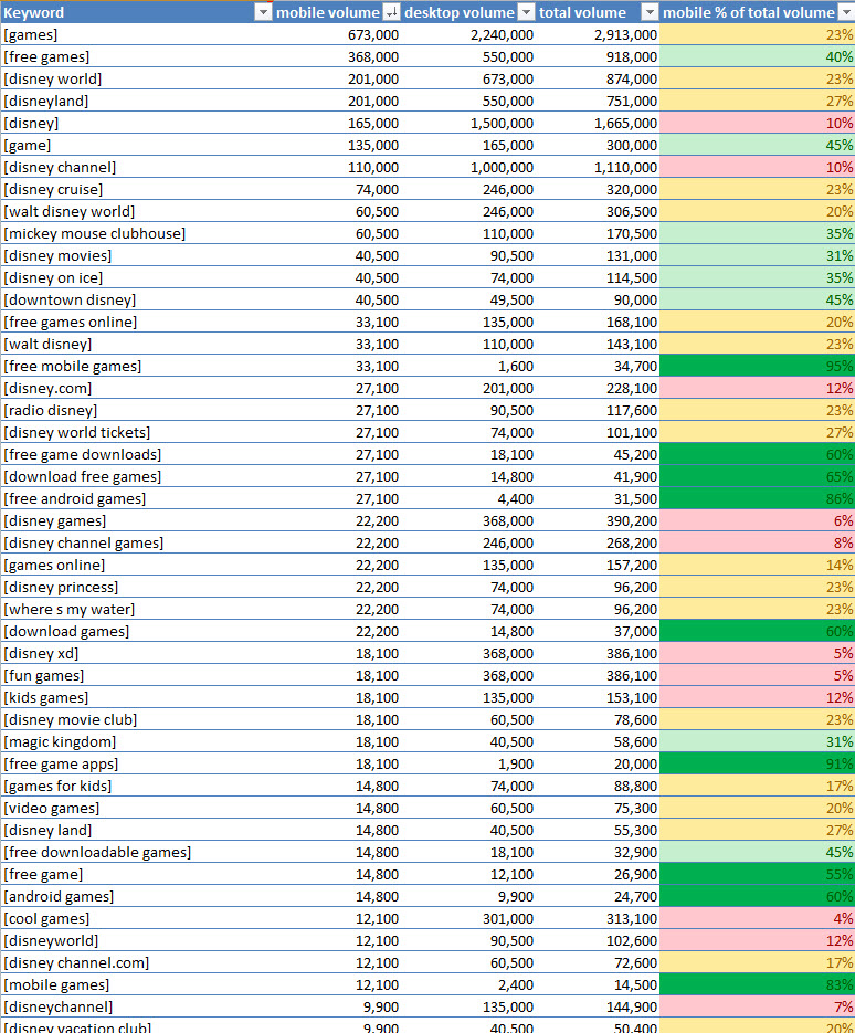
Non-branded games searches have as much search volume on mobile devices as many of Disney’s most popular brands.
There are also plenty of issues on all of these sites, not just with mobile keywords, but with keywords that become meaningless in a mobile context. Examples from Disney and Microsoft make this clear in point 1 above, but Starbucks is not immune at dealing with these adaptive content issues.
Here’s what happens if you’re one of the people who has done one of the 8,500 searches per month for [Starbucks coupons] from a mobile device in the US. Not only do you not get what you’re looking for (again, possible business reasons that may make sense), but you’re told to click the Print Coupon Button to redeem the nonexistent coupon:

Starbucks responsive web site asks you to print out a coupon from your mobile phone, and gives you how-to instructions that you’ll never be able to follow.
It’s like one bad user experience piled onto another, and it’s all due to making a site responsive without understanding how that changes the meaning of the content and the relevance of the queries.
Could all of these issues be resolved using responsive Web design? Maybe. But, because responsive Web designers and SEOs are not currently looking for them, this is likely to be an edge case, if it happens at all.
3. Many Responsive Websites Are Slow
Yes, to all of you who commented that responsive websites can be fast if done correctly. I agree with you; but, that’s not the point. The point is: “fast responsive website,” while not exactly an oxymoron, is certainly an edge case.
I’m not the only one saying this, either. Most of you are, in fact, as the majority of commenters who objected to this point in last month’s article told me it’s the developers’ fault, not responsive design’s. But, as an SEO, I don’t care whose fault it is, only that it happens. If responsive websites are slow, as many are, they could be bad for the searcher experience and bad for SEO.
And, as I said in the comments, it happens a lot. According to Akamai performance evangelist Guy Podjarny, “You can’t escape this fact. A responsive website tuned to perform optimally would not be as fast as a dedicated mdot site tuned equally well. Or, more realistically, an average responsive website would always be slower than an average mdot site.” In other words, slow responsive sites are not the exception, but the rule.
4. Responsive Websites Are Losing More Than 10% Of Global Mobile Web Traffic
As a marketer, do you frequently avoid the potential to connect with 158 million visitors and 98 billion page views? Because this is currently what you’re missing if you ignore global feature phone users on just the Opera browser, as of December 2012.
According to their most recent State of the Mobile Web report, Opera reported that 229,000,000 visitors had 143,000,000,000 pageviews globally from either Opera Mobile or Opera Mini. They also said that 68% of their visits come from something other than a smartphone. If you do the math, you get the figures mentioned above.
Given that Opera has 15.4% market share, we can extrapolate that this is 10.63% of total mobile Web market share worldwide.
You can make a business decision about whether ignoring 10% of the global mobile Web traffic is something you’re willing to do, but this is certainly too large a number to be an outlier.
As some of you said in the comments last month, build a site mobile first, and responsive would give some sort of experience to feature phone users as well. But, there are two problems with this:
- it’s not recommended by Google, which recommends separate sites or dynamic-serving-only for a site that works on feature phones and smartphones
- building mobile first may make you future-friendly while alienating a lot of primary desktop users in the present
Many companies you would think would be mobile first, like the Weather Channel, don’t see mobile first as being a viable strategy for another couple of years.
5. All Responsive Sites Don’t Delight Users With Mobile-Only Features
By nature, this last one is not an edge case, as responsive design is about making the same content available to all platforms, not about adding functionality depending on what devices are supported.
As explained last month, we have the ability as marketers to use mobile-specific features like GPS, camera, accelerometer, etc., to create app-like experiences on the Web that will rival what’s possible in native apps, but be seen and enjoyed by everyone, regardless of platform.
And, I still don’t know why we as marketers are content to do without this so we can make our sites responsive. One Web is a good start, but we should be doing more.
I had a discussion with the Thunder Tech user experience team on their blog last month, and they argued that these experiences belong in apps and not websites. However, this is the difference between User Experience and SEO. As SEOs, we should want to make the experiences that people really find engaging as visible as possible, and the Web, unlike native apps, has 100% reach.
With HTML5, we can make increasingly app-like experiences available on the Web, and this kind of content is likely not just to bring qualified traffic, but also links, shares and all of the signals that Google relies on to understand that our sites are authoritative. How is it better for SEO when we’re content to leave all of these things at the door in order to make our sites responsive?
I don’t know how common the practice of building app-like experiences on the Web is, but I did find an example of one brand that is seeing great results after building a more app-like mobile Web experience through dynamic serving. Hopefully, more of you in the future will follow suit.

According to Nielsen and Business Insider, consumers spend more time in apps than on the mobile web. While games and social networking are part of the story, how much are webmasters to blame for not making web experiences more app-like and engaging?
If you’ve made it to the end of this post, you have seen many instances where the five things I discussed last month are evident, and definitely not outliers. Google may still consider these things edge cases, but if you see that searchers are getting stranded, confused and unable to convert, it could help your business and the user if you fix it.
So, the next time someone tells you that responsive Web design is always best for SEO, you now have examples of many responsive sites, some of which are critically-acclaimed, that are not helping themselves at all with SEO. I think you can do better.
TL; DR Recap
Problems responsive websites have with SEO are common because:
- Several critically-acclaimed responsive we sites have major information architecture issues that are preventing searchers from completing a task, and businesses from generating revenue from these leads.
- These same websites ignore keywords that are most important to mobile searchers, to the detriment of the business and the user.
- Though responsive sites can be made fast, most of them aren’t.
- Google doesn’t recommend responsive Web design for capturing feature phone traffic, and that is more than 10% of the total mobile Web traffic available.
- Responsive sites can’t by nature allow for content that’s not multi-platform, and these experiences can often help users, build organic links and generate revenue for a business.
Contributing authors are invited to create content for Search Engine Land and are chosen for their expertise and contribution to the search community. Our contributors work under the oversight of the editorial staff and contributions are checked for quality and relevance to our readers. The opinions they express are their own.
Related stories
New on Search Engine Land
About the author