SEO + UX = Success
These days, SEO best practices include consideration for the user experience (UX). Columnist Sherry Bonelli explains how SEO and UX work together to help both search engines and users.

In the good old days, SEO was simple. You stuffed a page full of keywords, and you ranked number one. Oh, if only it were that simple today! Now, Google (and the other search engines) literally take hundreds of factors into account when determining which pages rank high in search engine results pages (SERPs).
This new reality means that elements of user experience (UX) have been rolled into SEO best practices. How easy is your site to navigate? Do you have quality content that makes visitors want to stay and engage? Is your site secure, fast and mobile-friendly?
Think of the partnership of SEO and UX this way: SEO targets search engines, and UX targets your website’s visitors. Both share a common goal of giving users the best experience.
Here are some common website elements that impact both SEO and user experience.
Headings
Just as the headings of a printed work make it easier to find information, the headings of a web page make it easier for both visitors and search engine crawlers to understand and parse your content.
Headings (<h1>, <h2>, <h3>, <h4>, <h5> and <h6>) should tell the readers and search engines what the paragraphs/sections are about and show a logical hierarchy of the content. Headings also help users if they get lost on a page.
Only use one h1 tag on a page — that lets search engines and users know the page’s primary focus. H1s are normally the first piece of content on a page, placed near the top. (Think of h1s as the chapter title of a book.) Adding keywords toward the front of a heading can also help with rankings.
Other headers (h2 through h6) should follow h1s to structure and organize the rest of the page appropriately. The other headings can be used several times on a page, as long as it makes sense. You do not need to use all of them, either — sometimes your content may only need an h1 and some h2s.
Easy navigation and site structure
It may seem crazy that we’re still talking about easy site navigation… but we are. There are way too many sites out there that simply don’t get it. Your site structure is not only important for your users, but it’s your site’s roadmap for the search engines, too.
Remember that many of your visitors will not enter your site through your home page. This means that your site needs to be easy to navigate — no matter which page a searcher (or search engine crawler) lands on.
Your site’s navigation is not the place for fancy popups, a long list of options, hide-and-seek games or a place of dead ends where the user doesn’t know how to get back to another section of your site or get back to your home page.
Take a look at how healthcare giant Anthem’s menu overtakes the screen — on both desktop and mobile — when the menu is clicked:

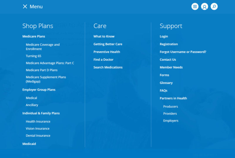

With the menu literally filling the entire screen, a user can’t read the content that’s underneath the navigation. This creates a very poor user experience. When people are on mobile devices, chances are they won’t have the patience to deal with menus like this.
Additionally, a clean site navigation and structure can also lead to sitelinks appearing in Google search results. Sitelinks can help you take over more real estate on search engine result pages — which means less room for your competitors (and, hopefully, more clicks for you).
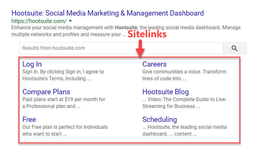
Google’s algorithm decides which sites get sitelinks (and which ones don’t). They base this decision largely on a site’s structure:
We only show sitelinks for results when we think they’ll be useful to the user. If the structure of your site doesn’t allow our algorithms to find good sitelinks, or we don’t think that the sitelinks for your site are relevant for the user’s query, we won’t show them.
User signals
I believe that user signals will increasingly become a more prominent factor in search engine rankings. Do you have Posts on Google My Business that visitors are clicking on? Are visitors on mobile devices using the click-to-call feature to dial your business? Are happy customers leaving five-star reviews for you — and are you responding to those reviews?
Although Google has denied that user signals such as time on site or bounce rate are direct ranking factors, studies have shown that there is a strong correlation between these signals and top rankings. Let’s put it this way: Google sees and knows everything. Every touch point and interaction your visitors have with you (and you have with them) shows Google that users are interested in and engaging with your content.
Site speed
Site speed has long been a ranking factor for Google search, and the company has even announced that mobile page speed (rather than desktop) will soon be used to determine this ranking factor. So not only is it important to have a website that loads quickly, but your mobile experience needs to be fast as well.
Google’s PageSpeed Insights tool allows you to enter your URL to see the issues your site might be having with mobile responsiveness. PageSpeed Insights measures how the page can improve its performance on both time to above-the-fold load and time to full page load and provides concrete suggestions for reducing page load time.
Amazingly, even the big sites with presumably large development and IT budgets have speed issues. See the poor results for the Harvard Business Review site:

Content-heavy and news sites should especially pay attention to site speed issues, since these sites are often viewed on mobile devices for the sake of convenience.
Mobile experience
When you think of “mobile experiences,” speed is definitely one consideration, but so is your mobile website as a whole — the look, feel, navigation, text, images and so forth.
Ever since Google released its mobile-friendly update in 2015, webmasters and SEOs have had to take “mobile-friendliness” into account as a ranking factor. And now, with the mobile-first index said to be coming in 2018, your mobile site will be considered your “main” website when Google’s algorithm is calculating rankings — thus making a good mobile experience all the more crucial.
Navigation is one of the most important components of a mobile experience — users and Google need to be able to find what they’re looking for quickly. Even button sizes and designs can impact user interaction on your mobile website. Every element on your mobile website impacts a user’s experience and directly (or indirectly) affects SEO as well.
In searching for an example of a local business’s mobile website, I found the one shown below. For this company’s mobile site, more than half of the above-the-fold real estate is taken up with meaningless information like huge logos and social media buttons. Plus, their menu is teeny-tiny and doesn’t even say “Menu” — it says “Go To…” and has the actual link to the menu to the far right-hand side. This does not make for a very user-friendly experience.

This company would be better off taking the clutter away from the top of the screen and making their menu, products and services more prominent for their mobile users.
Simple and smart design decisions like this will go a long way to making not only your visitors happy, but Google, too!
SEO and UX: A winning combination
Hopefully, you can see how SEO and UX go hand-in-hand in creating a successful website experience for both your human visitors and the search engines.
But what do you think? Do you think of your site’s users when you are creating content? How do you work with your design team to ensure that your site makes for a great mobile experience for your users? What is your balance between SEO factors and UX factors? We’d love to know!
Contributing authors are invited to create content for Search Engine Land and are chosen for their expertise and contribution to the search community. Our contributors work under the oversight of the editorial staff and contributions are checked for quality and relevance to our readers. The opinions they express are their own.
Related stories
About the author