10 Simple Tips To Make Your Excel Charts Sexier
Having covered all the basics of how to make tabular data tell a story using custom cell formatting and conditional formatting for both static tables and pivot tables, we’re now going to jump into the really fun stuff: charting data out in Excel. I’m not going to cover the basics of creating charts in this […]
Having covered all the basics of how to make tabular data tell a story using custom cell formatting and conditional formatting for both static tables and pivot tables, we’re now going to jump into the really fun stuff: charting data out in Excel.
I’m not going to cover the basics of creating charts in this post. If you want a primer, you can find this resource from Microsoft for the PC and this one for the Mac.
1. Remove Noise From Your Chart’s Background
When you’re presenting data, it’s very important to reduce the noise and hone in on actionable signals. If you have read just about anything I’ve written about Excel, you’ll know I loathe gridlines in tables. And yet, until I viewed this presentation by Ian Lurie, I was blissfully oblivious to gridlines in charts. But then, they cause my eye to stumble, too. And that’s the problem with noise: it distracts you from the essential stuff.
Gridlines are super easy to get rid of. First, remember the formatting trick I mention in all of my posts: if you want to format anything in Excel (in a chart or table) just select it and press Ctrl-1 (Mac: Command-1) to open the formatting dialog specific to that item.
In this case, you’ll just want to select one of the gridlines in your chart (anyone but the top one, which selects the entire plot area) and then open the formatting options. Finally, select Line Color > No line (Mac: Line > Solid > Color: No Line).
Click for larger image.
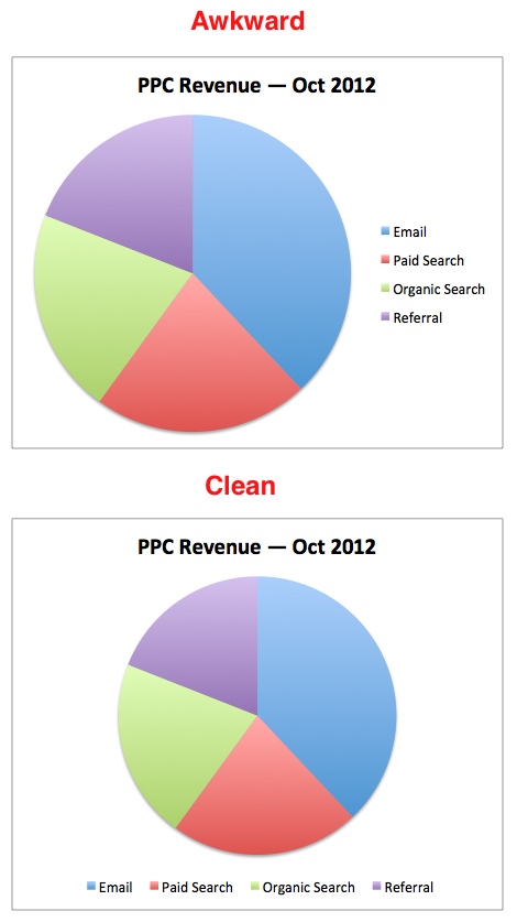
2. Move The Legend
I don’t know why Excel positions the legend to the right of a chart by default. In most cases, it’s terribly awkward. I prefer to move the legend to the top or bottom of a chart. I tend to put the legend above more than below, but I’ll put it below if there’s too much going on at the top, or sometimes, with a pie chart.
To move it, just pull up the formatting option (you should know how by now!) and choose the position from Legend Options category, which is called Placement on a Mac.
With the legend still selected, I usually bump the font up to 12 as well. You don’t have to select the text, just the box. You be the judge which looks better…
3. Delete Legends With One Data Series
If you’re only showing one metric on a chart, there’s no reason to keep the legend that Excel throws in there. Just make sure you include the metric you’re showing in the chart title.
Click for larger image.
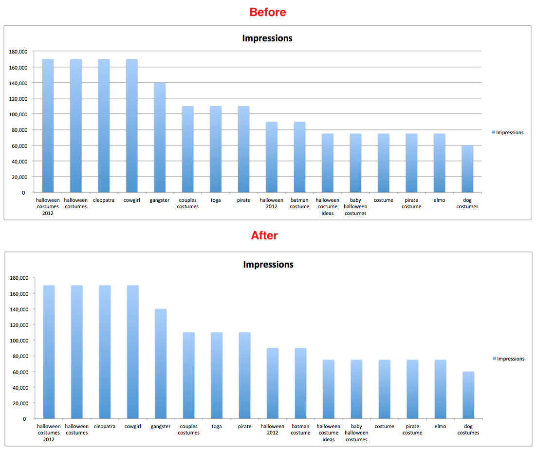
4. Add A Descriptive Title
A common mistake I see with marketers’ charts is they’re oftentimes missing a title. When you’re the one pulling together the data, everything you’re trying to communicate is perfectly clear. But for others who have to try to figure out what you’re trying to communicate, it’s not always so apparent.
So, in the case of the chart below, it would be insufficient to just use “Impressions” as the chart title:
To add a chart title, with your chart selected, choose Chart Tools > Layout > Labels > Chart Title. On the Mac, you’ll choose Charts > Chart Layout > Labels > Chart Title. I always choose Above Chart (Mac: Chart at Top).
5. Sort Your Data Before Charting
This one is actually a big deal to me. Charts that are spawned from unsorted data are, in my opinion, much more difficult to read and interpret.
If you’re showing something sequential, like visits per day over a period of a month or revenue per month over a period of a year, then ordering your data chronologically makes the most sense. In the absence of a dominant sort pattern like that, I’m of the opinion that data should be ordered and presented in descending order to put the most significant data first.
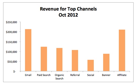
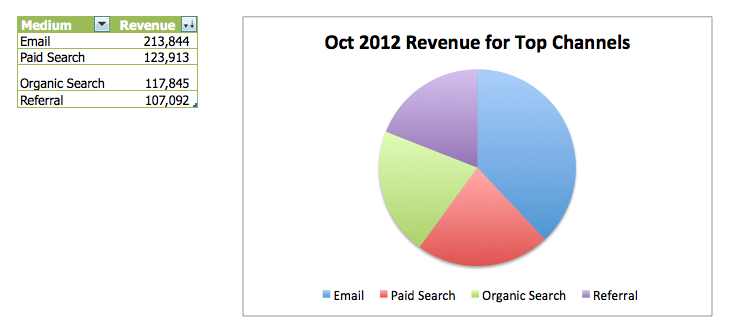
If you look at the data in the chart immediately below, I think you’ll agree that your eyes have to dart back and forth to sort the channels by revenue.
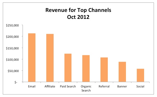
However, in the chart below, which is sorted in descending order, it’s easy to sort and interpret because it’s basically done for you.
This is another benefit to formatting your data as a table before charting it out — the ability to sort is built into the filters baked into every table heading. And if you already created the chart from the table, all is not lost. Once you sort your data in the table, your chart will update automatically.
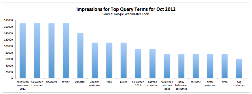
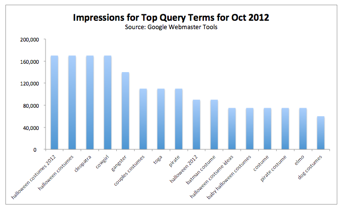
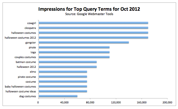
6. Don’t Make People Head Tilt
Have you ever seen a chart that does this?
Click for larger image.
Or worse… this?
Click for larger image.
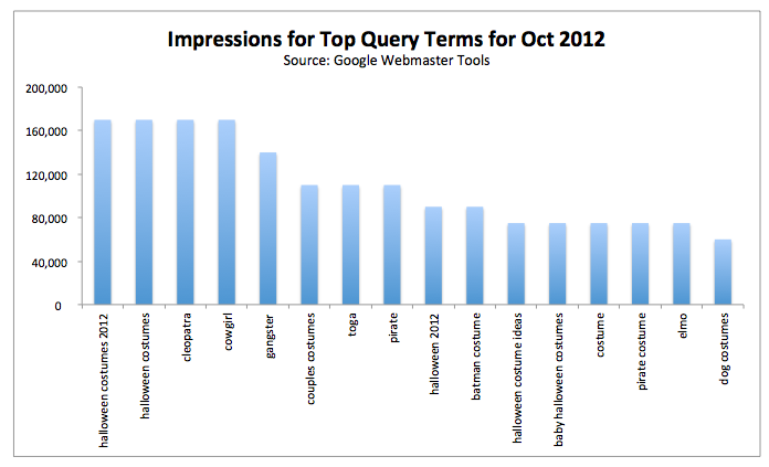
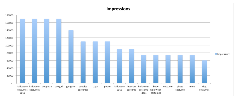
This can make data interpretation laborious and vulnerable to misinterpretation. If you have longer labels, it’s better to expand your chart enough to make room for the axis labels to be displayed horizontally or (even better) use a bar chart instead of a column chart, like so:
Click for larger image.
Tip: With bar charts, if you want the larger values to be at the top of the chart, like you see in the chart above, you need to arrange the table data for that column (in this case, the Impressions column from my Google Webmaster Tools export) in ascending order instead of descending order.
It’s counter-intuitive, in my opinion, but if you don’t, you’re going to have the most insignificant data at the top of your chart. And people naturally read charts from top to bottom, so I want to put the most important data at the top.
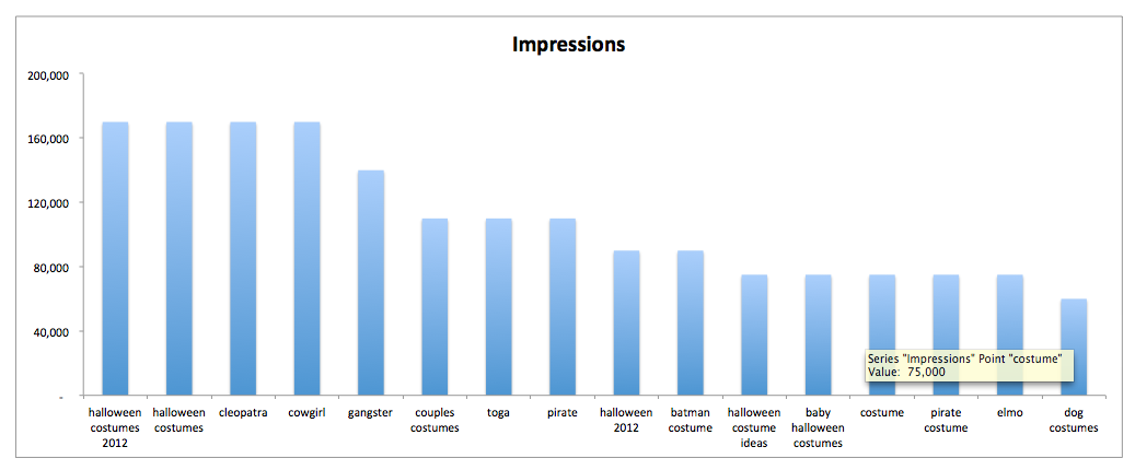
7. Clean Up Your Axes
This chart below is a royal train wreck and has everything I hate most in chart axes.
Click for larger image.
Before doing anything to the axes, I’m going to remove the gridlines and the legend. I’ll focus on five common problematic formatting issues I see in chart axes.
Missing Thousands Separators
If you have data points that are greater than 999, you should include thousands separators. The best way to do this is to format the data in the table. If you do that, the chart will update automatically. Otherwise, you need to unlink it from the source in the Format Axis dialog.
To add thousands separators, select the entire column and click the button with what looks like a comma in the Home tab in the Number category. Excel always adds two decimal places, which you have to get rid of by clicking the Decrease Decimal icon, which is two spots to the right of the thousands separator.
Alternatively, you could get into the formatting dialog and modify the number formatting there.
Cluttered Axes
The vertical axis in the chart above is also cluttered and overkill. To rectify this, select the axis and open the formatting dialog. Under Axis Options (Mac: Scale) you can change the Major Unit setting. In the screenshot below, I changed the major unit from 20000 to 40000.
By all means, if you need more granular detail, adjust your settings appropriately.
Click for larger image.
Unnecessary Decimals
Never include decimals in an axis, unless your maximum value is 1 (in other words, you’re only dealing with fractions). I see this most commonly done with currency, where you’ll see labels like $10,000.oo, $20,000.00, $30,000.00, etc. It’s extraneous and noisy.
Decimals Instead Of Percentages
If you’re trying to show percentages in the vertical axis, format them as a percent; don’t format the data as decimals. The less time people have to spend interpreting your data, the more compelling it will be. But, again, even with percentages, drop the decimals. In other words, don’t have labels like 10.00%, 20.00%, etc. Just use 10%, 20%, etc.
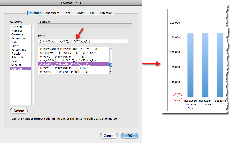
Weird Zero Formatting
One final nuisance is the presentation of the 0 at the bottom of the vertical axis as a hyphen. This is very common. You can read my post on custom number formatting to learn about how custom number formatting works. You might find some very surprising options, like the ability to add text to the formatting while still keeping the value of a number.
In this case, we just need to change the way 0 is formatted. To do this, select the column in the table where the data comes from, open the formatting dialog as usual, and select Number > Category: Custom, find the hyphen, and replace it with a 0.
Click for larger image.
As a finishing touch, I gave the chart a better title, and here’s the final result:

Click for larger image.
8. Explore Other Themes
Excel’s chart formatting options are pretty impressive, but most people never leave Excel’s default “Office” theme.
There are 53 themes offered in the 2010 version for PC and 57 themes in the 2011 version for the Mac. And each theme comes with its own unique set of chart formats — 48 in all. That’s 2,544 built-in chart formatting options for 2010 and 2,736 for 2011. (Whooooahhhh. Double rainbowww…)
You can switch themes by going to Page Layout > Themes > Themes (Mac: Home > Themes) and choose from the drop-down menu.
Some of them get a little cra-cra, like the Habitat theme (Mac only) that gives your charts a texture.
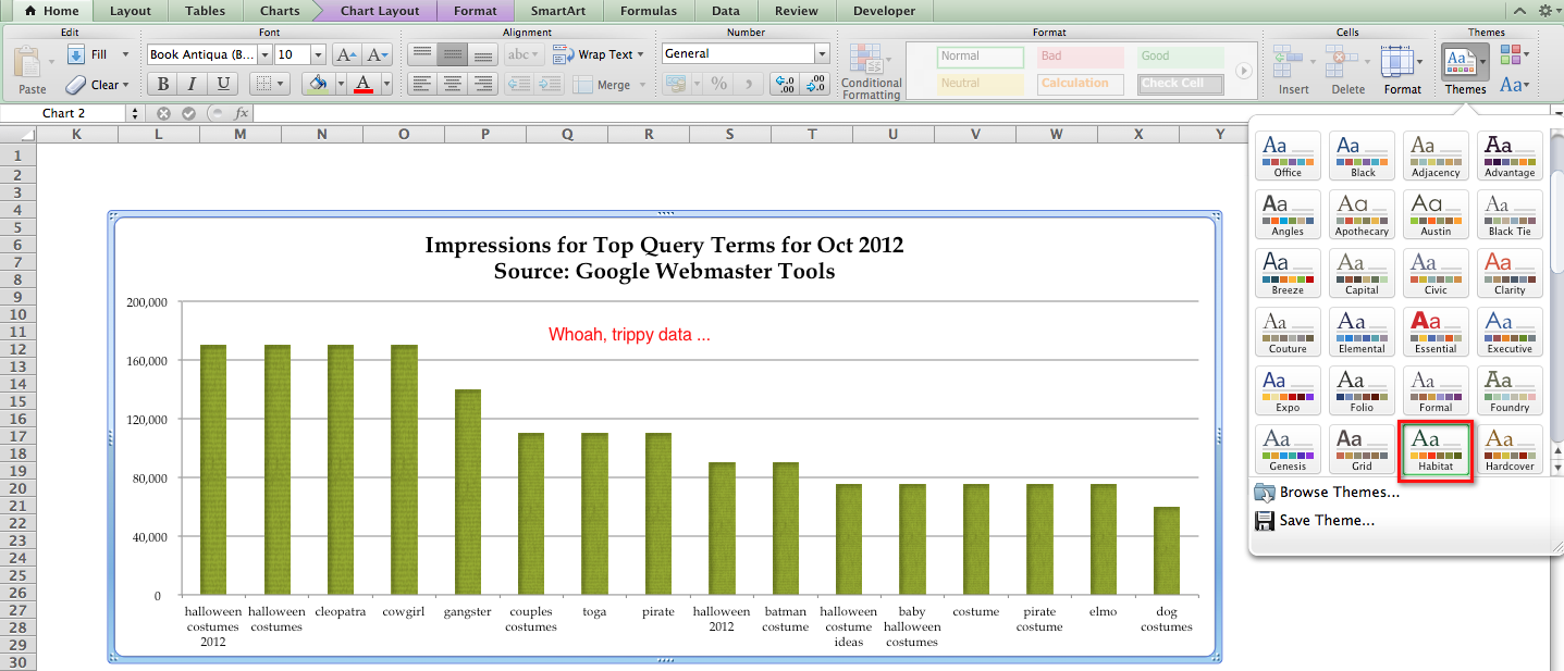
Click for larger image.
But you should explore the different themes and try branching out.
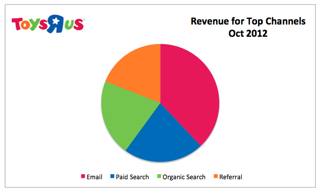
9. Create Branded Charts
You’re not limited to the 2,500+ themes Excel provides. If you want your data to be aligned with your brand, you could create a chart with your branded colors, then save that off as a template.
So, let’s say you doing marketing for Toys R Us (which I’m not affiliated with in any way), and you want to use a pie chart in a presentation with your branded colors. Excel 2010 (PC) will allow you to use RGB or HSL values, whereas Excel 2011 (Mac) will let you use RGB, CMYK, or HSB values.
(Since I wasn’t privy to those values, I used the Color Picker tool in the Web Developer Toolbar to identify the colors from the Toys R Us logo and then used a hex-to-RGB conversion tool to get the RGB values.)
Once you have the values you need, create a chart with whatever data you want to visualize.
Next, select a piece of the pie chart by clicking on the pie chart once and then on the individual piece. Then reformat it by using the paint bucket under Home > Font — or pull up the formatting dialog.
Assuming you have RGB values, click the drop-down menu on the paint bucket, choose More Colors > Custom > Color Model: RGB (Mac: More Colors > Color Sliders > RGB Sliders). And do that for each piece of the pie.
Your chart may look something like this:
PC:
To save it as a template on a PC, select the chart and navigate to Chart Tools > Design > Type > Save as Template.
To create a new pie chart based on this template on a PC, simply click inside the data you want to chart (or select the data if it’s a partial data set), then choose Insert > Charts > Other Charts > All Chart Types > Templates (Mac: Charts > Insert Chart > Other > Templates) and select the template you want to use.
Mac:
On a Mac, right-click anywhere on the chart and choose Save as Template. This will save your chart as a .crtx file in a chart templates folder.
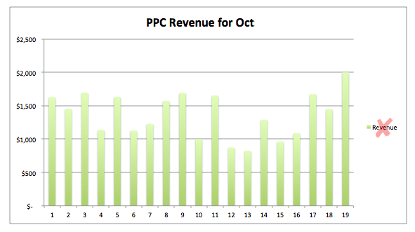
10. Make Your Chart Title Dynamic
Did you know you can make your chart title update by linking it to a cell in your workbook? It’s a bit of a hack, but it’s a cool option that will make you look like a genius to your boss/client/mom.
Dynamic titles are best suited for data that update on a regular basis, like daily numbers entered manually or pulled into Excel from a database.
What I’m going to demonstrate is a PPC revenue report that updates daily. The title will show the running total for the month up to that day. Here are the steps you’ll need to take:
Step 1:
Make sure your data uses proper number formatting and that it’s formatted as a table, which is Excel’s version of a simple database. The reason you want to format as a table is if you build a chart from a table, your chart will update automatically as you add new rows to the table.
The table also automatically expands to absorb any new data you add to the table when you just enter something in a cell immediately below or to the right of a formatted table.
Step 2:
In a cell just south of row 31 (to accommodate a full month) enter a SUM formula that captures all 31 rows — even though some will be blank if you’re only partway through the month.

Click for larger image.
Step 3:
If we were using both columns of our table as a data series, we could just click any cell inside the table and choose Insert > Charts > Column (Mac: Charts > Column).
But in the table below, we would just select the header and cells that contain revenue data. This is because we don’t want the days of the week to become a data series. You have lots of formatting options under Chart Tools > Design > Chart Styles (Mac: Charts > Chart Styles).
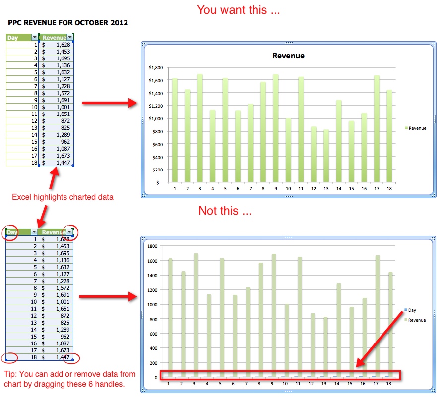
Click for larger image.
Step 4:
Add a title to your chart that indicates you have a running total. I used: “PPC Revenue for Oct:” for my title. See tip #4 above for directions.
Step 5:
Since the default fill for the chart area is white and the chart is generally displayed on a white sheet (which I recommend preserving), we’re going to change the Fill to No Fill without anyone being the wiser.
To do this, select the chart and press Ctrl/Command-1, then choose Fill: No Fill (Mac: Fill > Solid > Color > No Fill). You will definitely need to turn off gridlines to pull this off, but you should do that anyway. You can find this toggle under View > Show (Mac: Layout > View).
Step 6:
Select a cell above the chart just to the right of the title and reference the cell with the total. You reference a cell by simply putting an = sign in the cell and then typing in the cell reference or selecting it with your mouse. Excel will highlight the cell you’re referencing with a light blue as a visual aid. Then, format the cell with whatever formatting you used for your title.
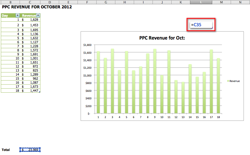
Click for larger image.
Step 7:
Now, all you have to do is move the chart up and align it with the title. It took some finagling to get everything lined up just right. But then, I just removed the legend since I just have one data series, and voilà! A dynamic title.
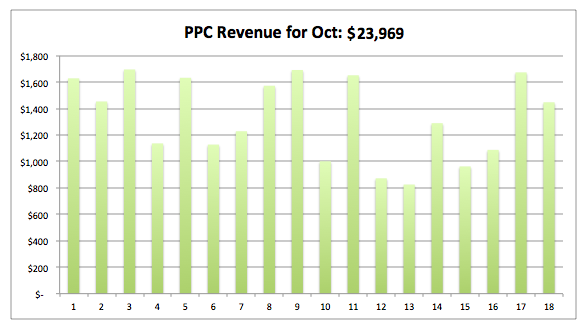
Click for larger image.
Step 8:
Now, when you add a new row to the table, the chart and title update dynamically. Slick, right?
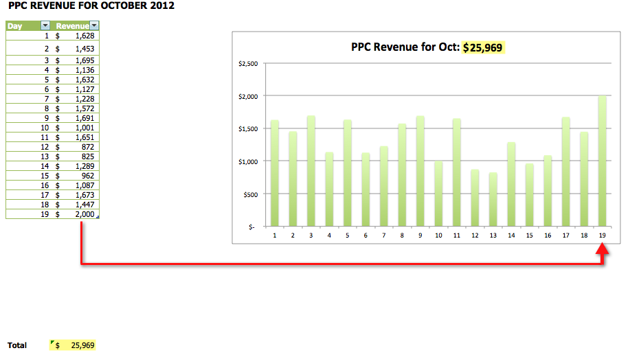
Click for larger image.
Clearly, charts provide dimension that’s much harder to get with a table. The good news is you can use any combination of these techniques to make your data sexier and more actionable in just a few minutes, once you get the hang of it.
If you have any questions about Excel or topic requests, feel free to reach out to me using the comments or contact form below or on Twitter: @AnnieCushing.
Contributing authors are invited to create content for Search Engine Land and are chosen for their expertise and contribution to the search community. Our contributors work under the oversight of the editorial staff and contributions are checked for quality and relevance to our readers. The opinions they express are their own.
Related stories
About the author