Dashboard Series: Creating Combination Charts In Excel
I’m starting a series on dashboards because I think creating sexy dashboards is a critical skill every marketer needs to know. It’s going to be a long series — but by the time we’re finished, you’ll be able to create dashboards that excel in both form and function. (Editor’s note: This popular series continues on […]
I’m starting a series on dashboards because I think creating sexy dashboards is a critical skill every marketer needs to know. It’s going to be a long series — but by the time we’re finished, you’ll be able to create dashboards that excel in both form and function. (Editor’s note: This popular series continues on Marketing Land with Creating Sexy Charts In Excel!)
Why Use Combination Charts?
The first skill we’re going to focus on to that end is how to create a combination chart. When I took MarketMotive’s analytics certification course, in my dissertation, Google Analytics evangelist Avinash Kaushik asked me why I didn’t show visits and bounce rate together in the same chart. (Disclosure: I am not affiliated with MarketMotive in any way.)
It’s embarrassing to admit this now, but I had no idea how to do that — or that you even could combine totally different metrics like that. But now, I use them all the time. The reason is that they give you the ability to demonstrate data trends visually. (So thanks, Avinash!)
Some classic metrics I use frequently in combination charts are:
- Year-over-year data
- Visits vs. bounce rate
- Revenue vs. conversion rate
- Campaign cost vs. conversions
Download The Excel Doc
If you’d like to follow along, feel free to download the Excel doc I pulled all my screenshots from.
How To Create A Combination Chart
Step 1: Have a dataset with at least the two values you want to chart. (I also always format my data as a table.)
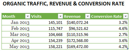
Step 2: Click any cell inside your dataset and go to Insert > Charts > Insert Column Charts > Clustered Column (in 2013 on the PC) or Charts > Column > Clustered Column (in 2011 on Mac). With my dataset, I’m just going to select the Visits and Revenue columns since I have an extra column for conversion rate.
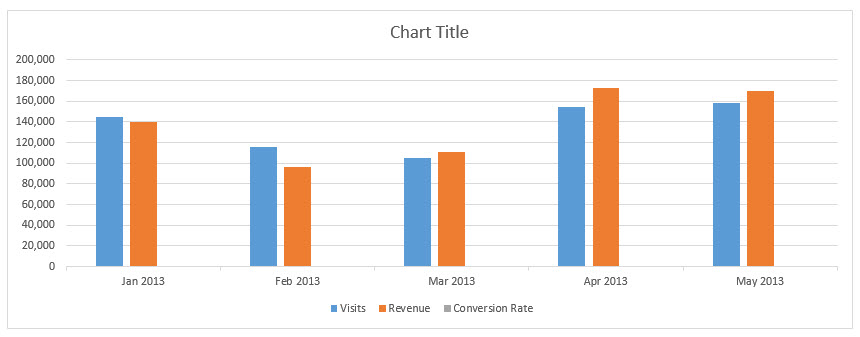
Click for larger image
Step 3: Clean up your chart with the techniques I describe in this post on sexying up your Excel charts. I cleaned mine up using several of the techniques I described in that post:
- Removed gridlines
- Thinned out the vertical axis
- Added an intuitive title
- Removed the tick marks in the horizontal axis
- Changed the default column colors to match my branding by selecting one of the columns in the series and choosing my new color using the Fill Color icon (under Home > Font for both versions)
All of these options are accessible to you by simply pressing Ctrl-1/Command-1 (PC/Mac).
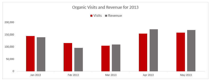
Click for larger image
Step 4: From here, you can change the chart type for one of your data series. For example, we could change the revenue to an area chart by selecting any one of the columns, then choosing Chart Tools > Design tab > Type > Change Chart Type. Once you’re in the newly revamped Change Chart Type dialog, just set Revenue to Area from the drop-down menu. (In 2011 for Mac, choose Charts tab > Change Series Chart Type > Area.)
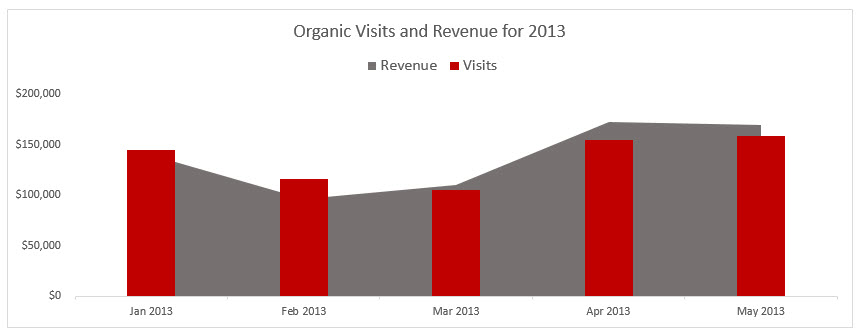
Click for larger image
Adding A Secondary Axis
Let’s say we want to also add conversion rate to the chart. I changed the Revenue series back to a column chart to decrease chart junk. One super cool trick to adding a new data series to a chart you’ve already created is to just select the column, copy it, select the entire chart (you’ll see the whole chart outlined), and then paste it in.
It won’t look amazing because we’re pasting in a value that’s less than one. But then, all you have to do if you’re following along with the download is: with the chart selected, choose the new series by going to Chart Tools > Format tab > Current Selection > Series “Conversion Rate” (2011: Charts tab > Format tab > Current Selection > Series “Conversion Rate).
To change the chart type to a line chart, I’ll break out the processes for 2013 and 2011 separately since the steps for the Mac are so different.
2013 (PC): With the Conversion Rate series selected, choose Design tab > Type > Change Chart Type. Then, in the Change Chart Type dialog, set Conversion Rate to Line from the drop-down. And put it in a secondary axis by selecting that option. Then click OK.
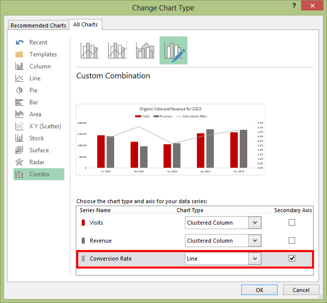
2011 (Mac): With the Conversion Rate series selected, choose Charts tab > Change Series Chart Type > Line > 2-D Line > Line. Then select the series again like you did before (it doesn’t stay selected for maximum frustration value) and press Command-1 to pull up your formatting options. In the Format Data Series dialog, choose Axis > Secondary axis. Then click OK.
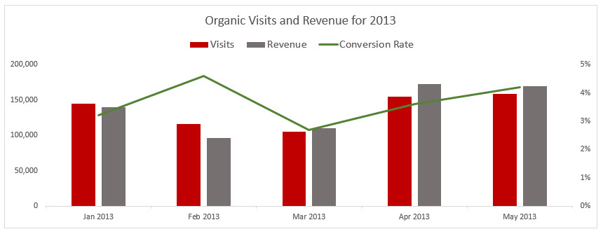
I changed the series color to green, thinned out the secondary axis, and ditched the decimal places. If you don’t need them to interpret the data, kick them to the curb. (I almost always get rid of decimal places in my axes!)
Click for larger image
A Few More Examples From The Wild
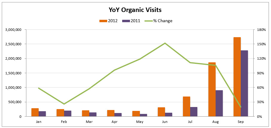
Here’s another example of a similar chart that combines a column and line chart to show year-over-year organic traffic for a client. I didn’t feel like the YoY wins stood out, so I created a calculated column that figured out the % increase/decrease in the table and then added % delta to the chart.
Click for larger image
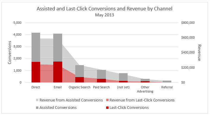
Here’s another one I did for a client to show them the number of assisted conversions they were getting by marketing channel. Most marketers are only reporting the conversions in red. We should be reporting on the assists, too! I addressed this topic at length in my SearchLove presentation, Take Credit Where Credit’s Due.
Click for larger image
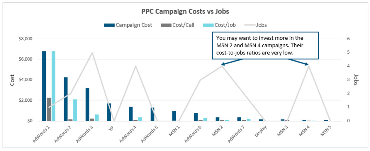
And, here’s one more I did for a client to be able to view their PPC campaign costs vis-a-vis their results. In this case, the first step in their conversion funnel is a call. The final step is an actual job. This chart has more data than most I create, but I wanted to capture both phases of conversions in one chart. You can see that two of their campaigns in Bing drove eight times more jobs than their AdWords campaign they’re sinking most of their resources into, for less than 1/10 the cost. That’s actionable data right there!
Click for larger image
More Tips On Making Data Sexy
I just presented on the topic of giving your data an extreme makeover at SMX Advanced in Seattle. You can check out my presentation, which contains lots of tips on cleaning up chart data.
This popular series continues on Marketing Land with Creating Sexy Charts In Excel!
Contributing authors are invited to create content for Search Engine Land and are chosen for their expertise and contribution to the search community. Our contributors work under the oversight of the editorial staff and contributions are checked for quality and relevance to our readers. The opinions they express are their own.
Related stories
New on Search Engine Land
About the author