New Google UI In Wild Again, With Auto-Detected Location
The new jazzy Google user interface that Google has been testing since November 2009 has been showing up more on user screens. It resurfaced in February, and now we have been hearing more reports of people noticing the new interface and our very own Vanessa Fox also has been seeing it on her browser. NOTE: […]
The new jazzy Google user interface that Google has been testing since November 2009 has been showing up more on user screens. It resurfaced in February, and now we have been hearing more reports of people noticing the new interface and our very own Vanessa Fox also has been seeing it on her browser.
NOTE: Google’s new look is now live. See: Meet The New Google & Its Colorful, Useful “Search Options” Column.
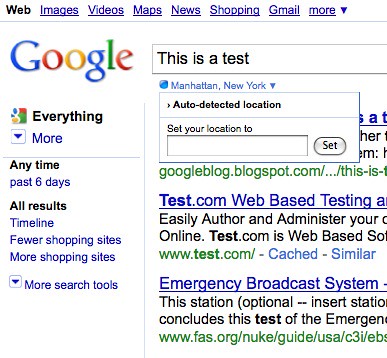
The main new feature that we see in this interface is that Google is auto-detecting user’s location and showing that under the search box. Here is a screen shot from Sara Holoubek of that:
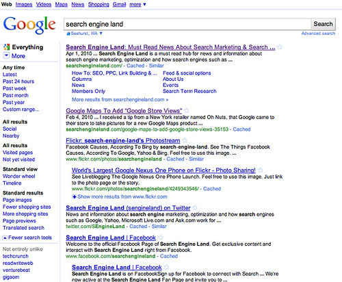
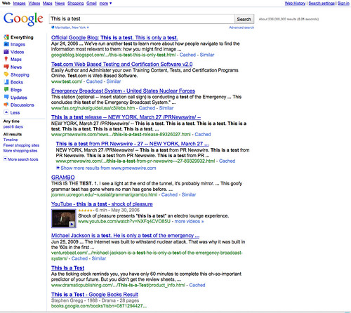
Vanessa, who is based in Seattle, also sent me a screen capture of the full page. Here it is:
Update from Vanessa: I noticed a few interesting features of this new interface.
- Not entirely unlike: Not all queries show this feature, but you can see it, for instance, with a search for [Search Engine Land] below. Google has had the related: advanced operator for a long time available via the Similar link in the search results, but only for sites, not for queries. It’s hard to tell what queries trigger this, as it shows up for pizza (not unlike falafal!) but not for restaurants.

- Nearby: As Barry noted above, your autodetected location appears below the search box. A searcher’s physical location has influenced web search results for quite a while, but what appears to be new is a “nearby” filter. (However, every time I tried this option, Google returned a “no results” message, so this feature may still be a work in progress.)
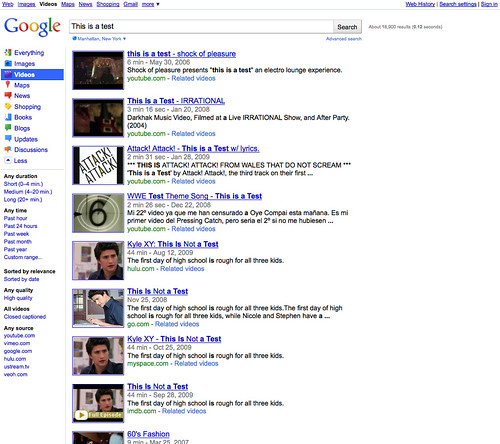
- Filters based on the query: I also noticed that what options appeared depended on the query type. All filters were available through the More link, but the defaults varied. For instance, a search for [skate shoes] shows the fewer/more shopping sites filter by default, whereas a search for [Obama] shows time options, wonder wheel, timeline, and page images.


I also found that different queries list different time filters ([Obama] suggests two days while [health care reform] suggest three days).

The listed search verticals changed based on the query as well. A search for [restaurants] lists Maps as an option, but a search for [Obama] lists Videos instead.


We know this is not fully available for everyone just yet. Most of us do not yet see the new interface, but there is a new batch of people who do see it. Towards the end of February, Google began pushing this test interface to more users. I guess this is there second major push. Google told us they are still testing this interface.
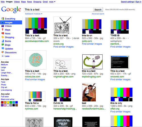
Here are some additional screens as well:
Related stories
About the author
In 2019, Barry was awarded the Outstanding Community Services Award from Search Engine Land, in 2018 he was awarded the US Search Awards the "US Search Personality Of The Year," you can learn more over here and in 2023 he was listed as a top 50 most influential PPCer by Marketing O'Clock.
Barry can be followed on X here and you can learn more about Barry Schwartz over here or on his personal site.