Finally going mobile-friendly, but on a collision course with Google’s mobile-first index [Case Study]
Google's index has been shifting toward 'mobile-first,' making mobile pages the default pages for ranking purposes. Columnist Glenn Gabe uses a case study to illustrate some of the issues this might pose for site owners.

This fall was packed with announcements about Google’s mobile-first index. First, Gary Illyes gave a keynote at Pubcon and dropped a bomb that Google intended to roll out a mobile-first index in the near future.
Sure, Google had been hinting about the mobile-first index for a while, but now we had real information from a Googler that it was indeed coming.
Then on November 4, 2016, Google published a blog post officially stating its intention to roll out a mobile-first index and explaining why it wanted to do that. It was huge news, since the new approach is a 180 from how things have worked for a long time. I’ll cover more about that soon.
My point today isn’t to detail the mobile-first index. That’s been done many times already. Instead, my purpose is to present a case study of a site that finally went mobile-friendly but will end up heading face-first into the mobile-first index. Sure, the mobile-first index hasn’t rolled out fully yet, but it’s going to soon. And we also know that it’s being tested in the wild.
(Actually, the November 10, 2016, algorithm update could have been — or partially could have been — Google testing the mobile-first index. You can read my post about the update to learn more about what I saw while analyzing sites impacted by that update. Note, there was also a substantial rollback of that update on November 18, which could indicate there was testing going on.)
The case I’ll present today is a good example of how changes from Google, and then on the client side, could end up colliding on the web. Both parties have the right intentions, but the collision could yield serious problems.
Quickly breaking down the mobile-first index: a 180 for search
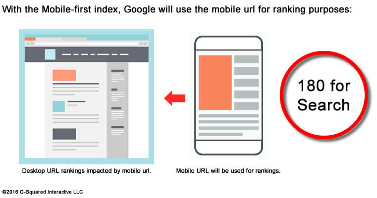
Before I explain the case study, I’ll quickly explain the mobile-first index. Currently, and until the mobile-first index rolls out, Google will use the desktop version of a page as the default for ranking purposes. (That’s for both desktop and mobile search rankings.)
Needless to say, that’s not optimal. Sites could be presenting a horrible user experience on mobile, less content, or even have spam on their mobile URLs, but Google would still use the desktop page and content for rankings.

Enter the mobile-first index. Once it fully rolls out, Google will begin to index the mobile page as the primary URL and use that for rankings (for both mobile and desktop rankings). The mobile URLs will also be used to understand structured data. So, it’s a 180 from the way things have worked up to now.
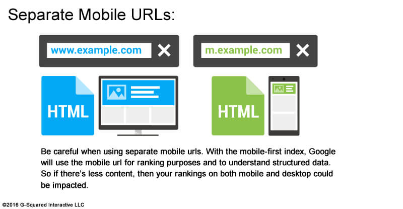
From a site owner perspective, if you’re using a responsive design, you should be fine. Technically, it’s the same content being presented on mobile and desktop. But if you’re using separate mobile URLs, or presenting different content on your mobile URLs via dynamic serving, then you have to be very careful.
It’s important to note that many sites provide the same content via dynamic serving (which would be fine). But there are times dynamic serving is used to present different content. So if you’re using dynamic serving, you still need to be careful.
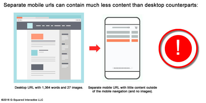
For example, you should make sure that your mobile pages contain the same content as your desktop pages, ensure that structured data markup is present on your mobile URLs and so on. If not, Google can index the mobile pages and then use the sub-optimal pages for rankings. Not good.

And for some sites, this can potentially cause massive problems (including a drop in rankings across URLs on both mobile and desktop) that could obviously result in a major drop in traffic.
Again, the mobile-first index has been covered extensively already, so I recommend reading those posts, FAQs and so on. Now to the case study.
Going mobile-friendly (finally): A redesign that was a long time in the making
This may sound shocking to some in the industry, but there are still sites out there that aren’t mobile-friendly yet. THE HORROR!

Image source: Popkey
One of my clients has been wanting to go mobile-friendly forever, but there were major limitations and issues from a CMS (content management system) standpoint that weren’t easy to overcome. And based on their niche, it’s not easy to simply move to a new CMS.
Migrating to a new CMS can be a pain the neck for any site, but for this niche, it’s really a pain in the neck (and could cause severe damage on multiple levels). That said, my client finally made the decision to pull the trigger, upgrade their CMS and go mobile-friendly.
Note: mobile-friendliness was not the only benefit of upgrading. There were several benefits from a usability and e-commerce standpoint beyond that, but going mobile-friendly was a major piece of the decision-making process.
One, two, three methods being used for mobile-friendliness
Many of you know that there are three core ways to go mobile-friendly. You could use responsive design (recommended), use dynamic serving (which changes the HTML based on user-agent), and then there are separate mobile URLs (where a completely separate URL is used to present content to mobile users).
Well, the CMS upgrade uses all three methods, depending on the type of page you are viewing. For example, the category pages use dynamic serving, the product pages use responsive design, and some other pages push mobile users to different URLs. Yes, it’s a Frankenstein mobile setup:

It’s important to note that Google is on record explaining that you can use multiple methods on your site. The mobile-friendly algorithm works on a URL-by-URL basis, so if each URL is mobile-friendly, they will pass the test (no matter which method is used). That’s fine, but that type of mobile-friendly setup can be confusing and hard to manage. I don’t necessarily recommend that companies go down that path.
And while auditing the new CMS in staging, it was clear that a number of pages were presenting different content between the desktop pages and mobile pages. For example, some pages contain much less content than their desktop counterparts. I found the setup odd, to say the least. So I clearly documented my findings, explaining that the setup was unorthodox at best.
And again, this was before any confirmation of the mobile-first index from Google this fall. I began auditing the new CMS in 2015 when my client started seriously considering the upgrade, well before Gary Illyes gave his Pubcon presentation introducing the mobile-first index in October of 2016.
Let’s do a quick recap:
- We have a site trying to go mobile-friendly.
- We had a recent announcement about Google’s mobile-first index, which will use mobile URLs for ranking purposes (for both desktop and mobile rankings).
- And we have a CMS using multiple methods for mobile-friendliness (and some pages contain much less content than their desktop counterparts).
If you’ve been paying close attention, you might see where this is headed.
Mobile-friendly: Awesome! Mobile-first index: Uh-oh…
The new site went live recently, and I’ve been heavily auditing the launch. All of the pages are indeed mobile-friendly, which is great. But it’s clear that some URLs are presenting much less content for mobile users (as mentioned earlier). And if the mobile-first index works the way that Google has explained it will, then this site could experience major turbulence when the new index fully rolls out.
There are two key areas where this could happen. First, there are category pages using dynamic serving that sometimes present much less content via mobile. (And sometimes, a heck of a lot less content.)

To make matters even worse, the CMS has injected scraped Wikipedia content on some category URLs when viewing the site on mobile devices. I picked that up while crawling the site as Googlebot for Smartphones and referencing Fetch and Render in Google Search Console. Wasn’t that a nice surprise? That’s in the process of being removed now.
So with the first scenario, we had much less content on some category pages when viewing on mobile devices, and some URLs combined less content with scraped content from Wikipedia. Very strange — and not a great way to go.
The second area of concern is when mobile users are taken to completely different URLs, and those URLs also contain less content. Again, Google will use the mobile URLs for ranking purposes, so the robust desktop pages won’t help this site when the mobile-first index rolls out. Not good, to say the least.
The potential impact
Google has clearly explained that site owners should make sure their mobile URLs contain the same content as the desktop pages. Those mobile URLs will be the ones used for ranking purposes and to understand structured data.
For this site, there are pages that use dynamic serving that contain much less content than their desktop counterparts, and there are also separate mobile URLs that contain less (and sometimes different) content. Both could end up negatively impacting rankings across both mobile and desktop.
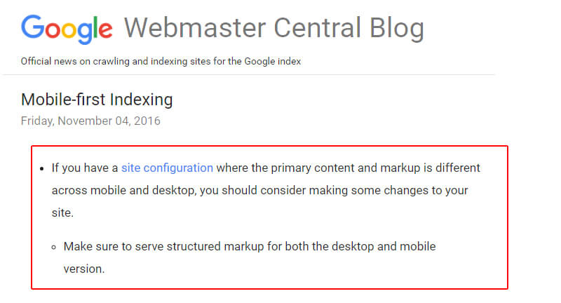
Here’s a quote directly from Google’s post about the mobile-first index:
Moving forward, my client has sent the CMS provider my findings along with information about Google’s mobile-first index. We hope that changes can be made to how mobile content is handled and presented on the site, but it’s hard to say if changes will happen any time soon.
The good news is that the mobile-first index hasn’t fully rolled out yet. The bad news is that it probably will soon (maybe even in Q1 of 2017).
Summary: Racing the mobile-first index
Based on what I explained above, we’re basically racing the mobile-first index right now. I can’t say yet who will win that race, Google or the CMS provider. But if history tells me anything, the mobile-first index will roll out way before major changes are made to the CMS. And that could be extremely problematic, given how the mobile-first index is supposed to work. Time will tell.
In the meantime, I highly recommend all sites review their current mobile setup, audit that setup, crawl the site as Googlebot for Smartphones, and use Fetch and Render to better understand how Google is seeing your content. There just may be problems sitting below the surface. I would try and surface those problems as soon as possible, and then make the necessary changes. Good luck.
Contributing authors are invited to create content for Search Engine Land and are chosen for their expertise and contribution to the search community. Our contributors work under the oversight of the editorial staff and contributions are checked for quality and relevance to our readers. Search Engine Land is owned by Semrush. Contributor was not asked to make any direct or indirect mentions of Semrush. The opinions they express are their own.
About the Author