Measuring the quality of popular keyword research tools
Contributor JR Oakes measures the quality of popular keyword research tools against data found in Google search results and performing page data from Google Search Console.
Ever wondered how the results of some popular keyword research tools stack up against the information Google Search Console provides? This article looks at comparing data from Google Search Console (GSC) search analytics against notable keyword research tools and what you can extract from Google.
As a bonus, you can get related searches and people also search data results from Google search results by using the code at the end of this article.
This article is not meant to be a scientific analysis, as it only includes data from seven websites. To be sure, we were gathering somewhat comprehensive data: we selected websites from the US and the UK plus different verticals.
Procedure
1. Started by defining industries with respect to various website verticals
We used SimilarWeb’s top categories to define the groupings and selected the following categories:
- Arts and entertainment.
- Autos and vehicles.
- Business and industry.
- Home and garden.
- Recreation and hobbies.
- Shopping.
- Reference.
We pulled anonymized data from a sample of our websites and were able to obtain unseen data from search engine optimization specialists (SEOs) Aaron Dicks and Daniel Dzhenev. Since this initial exploratory analysis involved quantitative and qualitative components, we wanted to spend time understanding the process and nuance rather than making the concessions required in scaling up an analysis. We do think this analysis can lead to a rough methodology for in-house SEOs to make a more informed decision on which tool may better fit their respective vertical.
2. Acquired GSC data from websites in each niche
Data was acquired from Google Search Console by programming and using a Jupyter notebook.
Jupyter notebooks are an open-source web application that allows you to create and share documents that contain live code, equations, visualizations and narrative text to extract website-level data from the Search Analytics API daily, providing much greater granularity than is currently available in Google’s web interface.
3. Gathered ranking keywords of a single internal page for each website
Since home pages tend to gather many keywords that may or may not be topically relevant to the actual content of the page, we selected an established and performing internal page so the rankings are more likely to be relevant to the content of the page. This is also more realistic, since users tend to do keyword research in the context of specific content ideas.
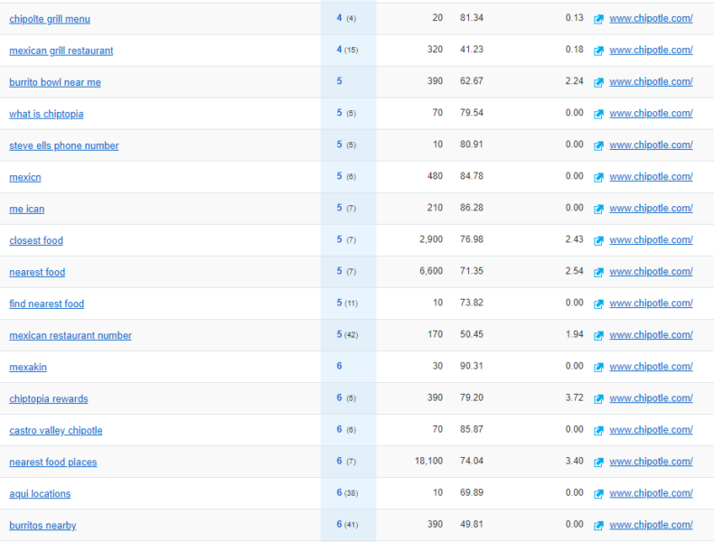
The image above is an example of the home page ranking for a variety of queries related to the business but not directly related to the content and intent of the page.
We removed brand terms and restricted the Google Search Console queries to first-page results.
Finally, we selected a head term for each page. The phrase “head term” is generally used to denote a popular keyword with high search volume. We chose terms with relatively high search volume, though not the absolute highest search volume. Of the queries with the most impressions, we selected the one that best represented the page.
4. Did keyword research in various keyword tools and looked for the head term
We then used the head term selected in the previous step to perform keyword research in three major tools: Ahrefs, Moz and SEMrush.
The “search suggestions” or “related searches” options were used, and all queries returned were kept, regardless of whether or not the tool specified a metric of how related the suggestions were to the head term.
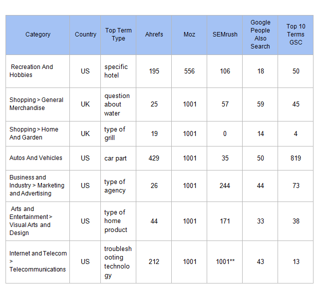
Below we listed the number of results from each tool. In addition, we extracted the “people also search for” and “related searches” from Google searches for each head term (respective to country) and added the number of results to give a baseline of what Google gives for free.
**This result returned more than 5,000 results! It was truncated to 1,001, which is the max workable and sorted by descending volume.
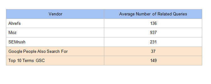
We compiled the average number of keywords returned per tool:
5. Processed the data
We then processed the queries for each source and website by using some language processing techniques to transform the words into their root forms (e.g., “running” to “run”), removed common words such as “a,” “the” and “and,” expanded contractions and then sorted the words.
For example, this process would transform “SEO agencies in Raleigh” to “agency Raleigh SEO.” This generally keeps the important words and puts them in order so that we can compare and remove similar queries.
We then created a percentage by dividing the number of unique terms by the total number of terms returned by the tool. This should tell us how much redundancy there are in the tools.
Unfortunately, it does not account for misspellings, which can also be problematic in keyword research tools because they add extra cruft (unnecessary, unwanted queries) to the results. Many years ago, it was possible to target common misspellings of terms on website pages. Today, search engines do a really good job of understanding what you typed, even if it’s misspelled.
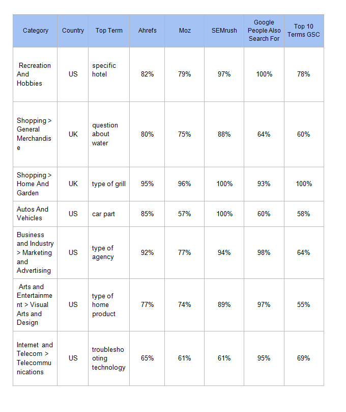
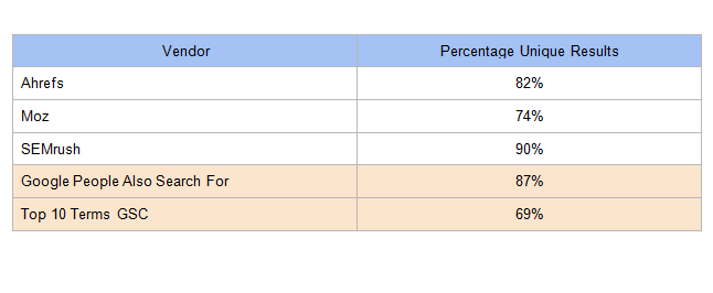
In the table below, SEMrush had the highest percentage of unique queries in their search suggestions.
This is important because, if 1,000 keywords are only 70 percent unique, that means 300 keywords basically have no unique value for the task you are performing.
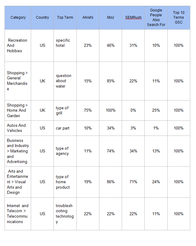
Next, we wanted to see how well the various tools found queries used to find these performing pages. We took the previously unique, normalized query phrases and looked at the percentage of GSC queries the tools had in their results.
In the chart below, note the average GSC coverage for each tool and that Moz is higher here, most likely because it returned 1,000 results for most head terms. All tools performed better than related queries scraped from Google (Use the code at the end of the article to do the same).
Getting into the vector space
After performing the previous analysis, we decided to convert the normalized query phrases into vector space to visually explore the variations in various tools.
Assigning to vector space uses something called pre-trained word vectors that are reduced in dimensionality (x and y coordinates) using a Python library called t-distributed Stochastic Neighbor Embedding (TSNE). Don’t worry if you are unfamiliar with this; generally, word vectors are words converted into numbers in such a way that the numbers represent the inherent semantics of the keywords.
Converting the words to numbers helps us process, analyze and plot the words. When the semantic values are plotted on a coordinate plane, we get a clear understanding of how the various keywords are related. Points grouped together will be more semantically related, while points distant from one another will be less related.
Shopping
This is an example where Moz returns 1,000 results, yet the search volume and searcher keyword variations are very low. This is likely caused by Moz semantically matching particular words instead of trying to match more to the meaning of the phrase. We asked Moz’s Russ Jones to better understand how Moz finds related phrases:
“Moz uses many different methods to find related terms. We use one algorithm that finds keywords with similar pages ranking for them, we use another ML algorithm that breaks up the phrase into constituent words and finds combinations of related words producing related phrases, etc. Each of these can be useful for different purposes, depending on whether you want very close or tangential topics. Are you looking to improve your rankings for a keyword or find sufficiently distinct keywords to write about that are still related? The results returned by Moz Explorer is our attempt to strike that balance.”
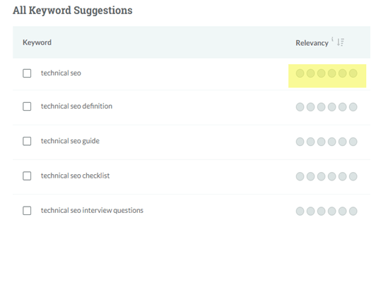
Moz does include a nice relevancy measure, as well as a filter for fine-tuning the keyword matches. For this analysis, we just used the default settings:
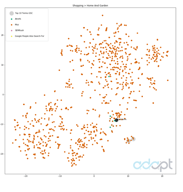
In the image below, the plot of the queries shows what is returned by each keyword vendor converted into the coordinate plane. The position and groupings impart some understanding of how keywords are related.
In this example, Moz (orange) produces a significant volume of various keywords, while other tools picked far fewer (Ahrefs in green) but more related to the initial topic:
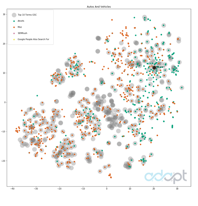
Autos and vehicles
This is a fun one. You can see that Moz and Ahrefs had pretty good coverage of this high-volume term. Moz won by matching 34 percent of the actual terms from Google Search Console. Moz had double the number of results (almost by default) that Ahrefs had.
SEMrush lagged here with 35 queries for a topic with a broad amount of useful variety.
The larger gray points represent more “ground truth” queries from Google Search Console. Other colors are the various tools used. Gray points with no overlaid color are queries that various tools did not match.
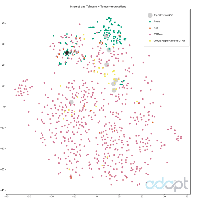
Internet and telecom
This plot is interesting in that SEMrush jumped to nearly 5,000 results, from the 50-200 range in other results. You can also see (toward the bottom) that there were many terms outside of what this page tended to rank for or that were superfluous to what would be needed to understand user queries for a new page:
Most tools grouped somewhat close to the head term, while you can see that SEMrush (in purplish-pink) produced a large number of potentially more unrelated points, even though Google People Also Search were found in certain groupings.
General merchandise
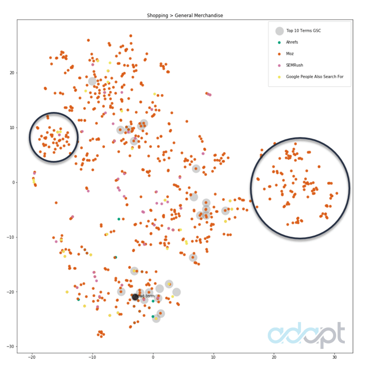
Here is an example of a keyword tool finding an interesting grouping of terms (groupings indicated by black circles) that the page currently doesn’t rank for. In reviewing the data, we found the grouping to the right makes sense for this page:
The two black circles help to visualize the ability to find groupings of related queries when plotting the text in this manner.
Analysis
Search engine optimization specialists with experience in keyword research know there is no one tool to rule them all. Depending on the data you need, you may need to consult a few tools to get what you are after.
Below are my general impressions from each tool after reviewing, qualitatively:
- The query data and numbers from our analysis of the uniqueness of results.
- The likelihood of finding terms that real users use to find performing pages.
Moz
Moz seems to have impressive numbers in terms of raw results, but we found that the overall quality and relevance of results was lacking in several cases.
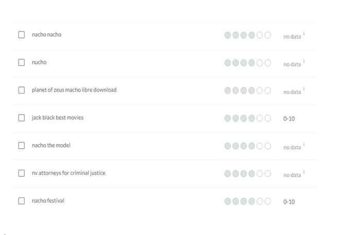
Even when playing with the relevancy scores, it quickly went off on tangents, providing queries that were in no way related to my head term (see Moz suggestions for “Nacho Libre” in image above).
With that said, Moz is very useful due to its comprehensive coverage, especially for SEOs working in smaller or newer verticals. In many cases, it is exceedingly difficult to find keywords for newer trending topics, so more keywords are definitely better here.
An average of 64 percent coverage for real user data from GSC for selected domains was very impressive This also tells you that while Moz’s results can tend to go down rabbit holes, they tend to get a lot right as well. They have traded off a loss of fidelity for comprehensiveness.
Ahrefs
Ahrefs was my favorite in terms of quality due to their nice marriage of comprehensive results with the minimal amount of clearly unrelated queries.
It had the lowest number of average reported keyword results per vendor, but this is actually misleading due to the large outlier from SEMrush. Across the various searches it tended to return a nice array of terms without a lot of clutter to wade through.
Most impressive to me was a specific type of niche grill that shared a name with a popular location. The results from Ahrefs stayed right on point, while SEMrush returned nothing, and Moz went off on tangents with many keywords related to the popular location.
A representative of Ahrefs clarified with me that their tool “search suggestions” uses data from Google Autosuggest. They currently do not have a true recommendation engine the way Moz does. Using “Also ranks for” and “Having same terms” data from Ahrefs would put them more on par with the number of keywords returned by other tools.
SEMrush
SEMrush overall offered great quality, with 90 percent of the keywords being unique It was also on par with Ahrefs in terms of matching queries from GSC.
It was, however, the most inconsistent in terms of the number of results returned. It yielded 1,000+ keywords (actually 5,000) for Internet and Telecom > Telecommunications yet only covered 22 percent of the queries in GSC. For another result, it was the only one not to return related keywords. This is a very small dataset, so there is clearly an argument that these were anomalies.
Google: People Also Search For/Related Searches
These results were extremely interesting because they tended to more closely match the types of searches users would make while in a particular buying state, as opposed to those specifically related to a particular phrase.
For example, looking up “[term] shower curtains” returned “[term] toilet seats.”
These are unrelated from a semantic standpoint, but they are both relevant for someone redoing their bathroom, suggesting the similarities are based on user intent and not necessarily the keywords themselves.
Also, since data from “people also search” are tied to the individual results in Google search engine result pages (SERPs), it is hard to say whether the terms are related to the search query or operate more like site links, which are more relevant to the individual page.
Code used
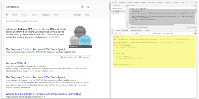
When entered into the Javascript Console of Google Chrome on a Google search results page, the following will output the “People also search for” and “Related searches” data in the page, if they exist.
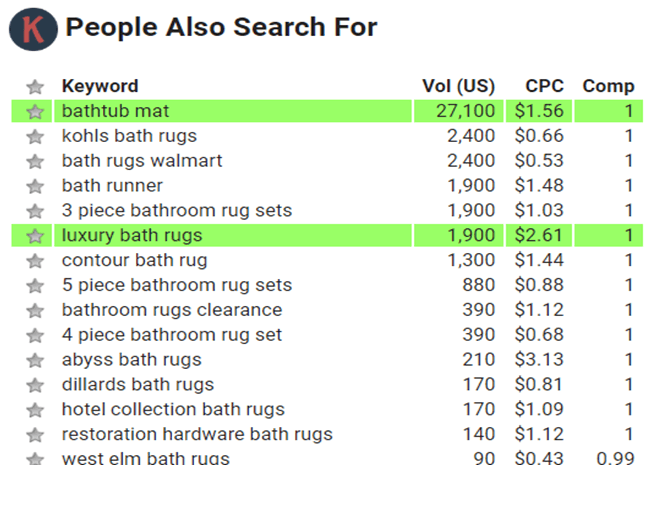
In addition, there is a Chrome add-on called Keywords Everywhere which will expose these terms in search results, as shown in several SERP screen shots throughout the article.
Conclusion
Especially for in-house marketers, it is important to understand which tools tend to have data most aligned to your vertical. In this analysis, we showed some benefits and drawbacks of a few popular tools across a small sample of topics. We hoped to provide an approach that could form the underpinnings of your own analysis or for further improvement and to give SEOs a more practical way of choosing a research tool.
Keyword research tools are constantly evolving and adding newly found queries through the use of clickstream data and other data sources. The utility in these tools rests squarely on their ability to help us understand more succinctly how to better position our content to fit real user interest and not on the raw number of keywords returned. Don’t just use what has always been used. Test various tools and gauge their usefulness for yourself.
Contributing authors are invited to create content for Search Engine Land and are chosen for their expertise and contribution to the search community. Our contributors work under the oversight of the editorial staff and contributions are checked for quality and relevance to our readers. The opinions they express are their own.
Related stories


