Bing: We Added A Border To Our Ads To Make Them More Visible
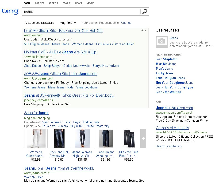
In response to our post yesterday about the often-invisible background shading on ads in the search engine results, Derrick Connel, Corporate Vice President of Bing Program Management at Microsoft, followed up with Danny Sullivan on Facebook to say: As a small comment on Bing — the ads have 2 design elements for mainline ads. We […]
In response to our post yesterday about the often-invisible background shading on ads in the search engine results, Derrick Connel, Corporate Vice President of Bing Program Management at Microsoft, followed up with Danny Sullivan on Facebook to say:
As a small comment on Bing — the ads have 2 design elements for mainline ads. We have the background shading and a line on the right. We added the line as a design element to help users understand where mainline ads starts and ends. Your point about background shading varying by screen is right. Given background colors show up differently on various screens we felt this was a good user feature. It tested very well for usability.
You can see the gray line Connell is referencing in the screenshot below.
Shading visibility is a widespread problem. While I was able to see Google’s pale yellow ad background on my laptop screen, several people have commented that Google’s shading is just as invisible on their laptop screens as Bing’s and Yahoo’s.
We’ll be doing some more testing on this to see how the search engines stack up across multiple devices and screen types. Stay tuned.
Contributing authors are invited to create content for Search Engine Land and are chosen for their expertise and contribution to the search community. Our contributors work under the oversight of the editorial staff and contributions are checked for quality and relevance to our readers. The opinions they express are their own.
Related stories
New on Search Engine Land
About the author