Google Tackles Its “UI Jazz” Problem, Tests Streamlining Search Options Feature
Sometime later today, a small number of Google users will see a new look to Google’s Search Options feature. If all goes well, the cleaner display may be launched across Google after the New Year. And it’s all because Google’s vice president of search product and user experience Marissa Mayer doesn’t like jazz. NOTE: Google’s […]
Sometime later today, a small number of Google users will see a new look to Google’s Search Options feature. If all goes well, the cleaner display may be launched across Google after the New Year. And it’s all because Google’s vice president of search product and user experience Marissa Mayer doesn’t like jazz.
NOTE: Google’s new look is now live. See: Meet The New Google & Its Colorful, Useful “Search Options” Column.
Simmer down, jazz lovers! Jazz is just not her thing; she’s not making a personal campaign against it. Instead, Mayer was using jazz to explain a pet metaphor she has about search results pages. They have their own “rhythm,” and Google’s results have been sounding a bit free form lately.
“I don’t like jazz, because you never know what’s going to happen next,” Mayer said, continuing on to apply the musical style to Google’s search results. “I’ve been calling this problem ‘user interface jazz.’ This result looks this way, and that result looks that way [something much different], and it really does slow you down.”
Indeed, it has felt a bit confusing with Google lately. When I wrote my Up Close With Google Search Options story in October, after new search option features were introduced, I detailed a number of inconsistencies in how they operate.
I haven’t yet finished another piece about a growing gripe I have, inconsistency in how Google enhances search listings with sitelinks. I never know where to expect them now. They can appear in in any position, within snippets, on a single line and in even more ways. It’s been making my head hurt.
I raised the inconsistency issues with Google cofounder Sergey Brin last month at a press conference, and he said experiments on this were in the works. So now we have a visual sign of that.
Search Modes
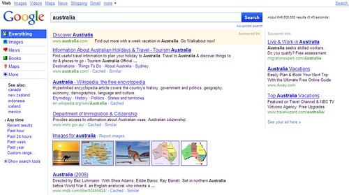
Personally, I’m glad if the results will be getting more predictable. But enough generalities. Let’s take a closer look at the changes. Here’s an overview of the new results page in testing (and yes, you can use the screenshots below if writing about this — just link over to our story):
“We’re basically looking at a new look and feel for Google,” Mayer said of the change. “It’s an overall cleaning up of the search results page.”
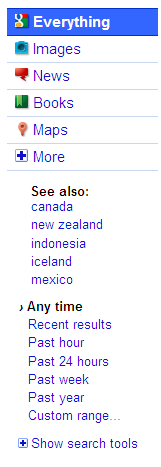
The search options appear in the left-hand column. The former “All results” area that allowed you to switch between different types of searches (images, news, maps and so on) has been replaced with new tabs for these services:
Internally, Mayer said that Google calls “modes.” For example, after searching for “australia” in the example above, you’re in “Everything” mode (I love this name). But with a click on the Images tab, you can switch to “image mode” and get back image results, select News to get news results in “news mode” so on.
By default, Google guesses at the modes it thinks are most relevant to your search. But the “More” tab gives you access to the full range of search services Google offers. If you Video mode, and that’s not automatically suggested, you can select More, choose Video and get those results:
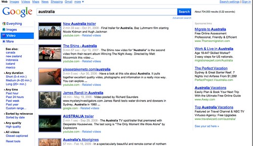
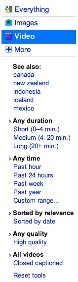
As happens now, when you switch modes, the search options change. In video mode, you get unique video filtering options such as duration of clip or to see only video in high quality:
New to the search options area in this test is a “See also” section that suggests other queries related to your original topic. As for a search on pizza, Google also suggests things like “tacos” or “fried chicken:”
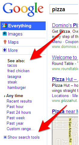
Interestingly, it doesn’t show more typical related queries that incorporate the main terms, as you can currently see at the bottom of results now for pizza, such as “pizza recipe.” But perhaps this will change.
As the second arrow in the screenshot shows, there are even more search features that you can access by using the “Show search tools” option. Features such as “Wonder Wheel” or “Timeline View” or “More shopping sites” all reside in this area (to learn more about these, see Up Close With Google Search Options).
Google 3D
The most dramatic change in the design is that the search options window is permanently open, rather having to be manually toggled on, as is the case now. That’s right. If the test proves successful, Google’s almost certainly moving to a three “pane” format, with search tools and options located on the left, search results themselves in the middle and ads on the right.
Mayer said going left made the most sense. Google continues to add new search features, and they need to be exposed to searchers somewhere. Putting them at the top of the page pushes results down; ads are already at the right. Having the tools on the left, with the pane permanently opened, is something she said she’s personally wanted for some time, but not everyone in the design team was convinced. The test will be a final proof of how well it works with Google’s audience.
“While I wish we had gotten here sooner, Mayer said, “I’m excited to finally have it out.”
But hey, wasn’t there a search engine that ushered in a three pane design like this not to long ago? Yep. Ask.com, with it’s Ask 3D view that was developed under then-Ask CEO Jim Lanzone. Bing and Yahoo now have three pane designs, as well. So did Ask have it right back then, I asked? And is the three pane view now the industry standard?
“Now you know why I’ve been searching for John Stuart Mill,” Mayer said, speaking of his book On Liberty and how it discusses that universal truths always come through.
“Is it the trend du jour or is that a universal truth,” she said, of a three pane design. “It is a likely universal truth.”
Mayer added that Google had recently done nearly 50 mockups, all done independently, to examine results. A three pane design was a common theme that kept coming up.
Bimodal World Of Screen Sizes
Mayer also spoke to the growth of screen sizes, pointing out that we’re in a “bimodal” world where screens are conversely getting larger on the desktop (and people have more of them) and smaller (as people do more and more browsing on mobile devices). So a three pane view may make no sense for mobile devices. But on the desktop, there’s much more room to spread out than in the past.
“This is a first step. We do think we can add that left navigation and it won’t impact the rest of the page,” she said, pointing out that currently, the actual search results only take up about 1/4 of the screen real estate available for a typical desktop viewer. She also said that Google will do more things in the future to take advantage of larger desktop screens.
What about the navigation bar at the top of the results, which people can also use to switch between different search options such as news and images. Is it becoming redundant as the left-pane continues to evolve?
Mayer said Google would revisit the design of the top navigation links area next year. But right now, it works, moving around “a ton of traffic” to different portions of Google. She also said it’s a helpful way to unify Google’s various properties. Plus, it allows people to go directly to a particular search service, such as image search, without first having to do an “everything” search and then refine it.
Search Button, Meet Search Box
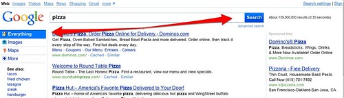
Looking at the new design, I remarked how noticeable it was that the search button is directly integrated into the search box. Consider the before:

And after:
![]()
Internally, plenty at Google have noticed the change and not necessarily liked it. “That’s has been one thing that’s drawn the most ire. If the ire continues [from the public testing], that may be one of the first thing that changes,” Mayer said.
She added that Google’s also closely looking at how well the Everything tab and the new Search button work, as illustrated below:
“That big blue Everything on the left and search button on the right, they do pull …. and we do intend to pull the user’s eye …. but I wonder if it’s putting the emphasis enough where we want,” she said.
Fading Home Page Slow People Down
Since we were talking design, I asked about that funky fading home page that Google’s been testing. Is that going to become permanent?
“The fading home page is either going to be reformulated or go into a whole new direction,” Mayer said. People visit it more and do more searches because of the change, she said metrics show. However, ironically, the page also slows them down. They take additional milliseconds to act (and for Google, every millisecond counts).
“Their time to first action is slower,” Mayer said. “It’s almost like they’re disoriented, thinking ‘What? Where is everything?”
That brings things back to the search results page. People like patterns. The more a page has an easy pattern that can be processed — the more “rhythmic you can make it,” Mayer said, the faster she says people will be.
So who sees the changes? About 1% to 3% of Google users, who will be randomly selected. The test will probably run for about six weeks. If successful, expect to see the changes — altered to take in account test feedback — show up across Google soon after that.
Postscript by Barry Schwartz: There are some people actually seeing the new user interface in the wild. Here is a screen shot of what people are seeing:
Postscript 2 (Nov. 25, 2009): Want to try the interface yourself? Google Blogoscoped has instructions on how to enable it.
Postscript 3 (Feb. 26,2010): See Yes, More Are Seeing A New Google Look-And-Feel.
Contributing authors are invited to create content for Search Engine Land and are chosen for their expertise and contribution to the search community. Our contributors work under the oversight of the editorial staff and contributions are checked for quality and relevance to our readers. The opinions they express are their own.
Related stories
New on Search Engine Land
About the author