Google Testing Android/Chromebook-Like Navigation Element For Web Site
Google is testing yet another navigation method to find all the various Google services and products, one that potentially serves to unify Google’s website with behavior on Android and Chromebooks. Google Operating System spotted this new test where you click on a box and it expands to show you more search options from Google. Here […]
Google is testing yet another navigation method to find all the various Google services and products, one that potentially serves to unify Google’s website with behavior on Android and Chromebooks.
Google Operating System spotted this new test where you click on a box and it expands to show you more search options from Google. Here is a picture:
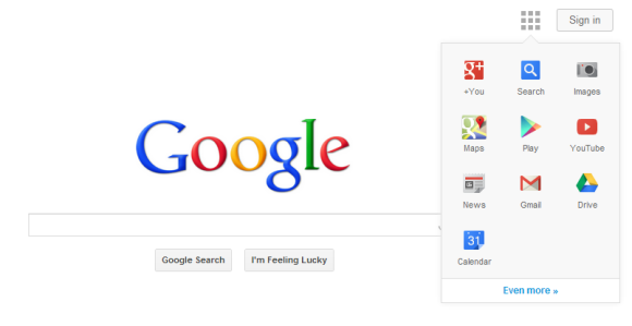
As you can see, Google+, Search, Images, Maps, Play, YouTune, News, Gmail, Drive and Calendar are the default options, but you can click on “even more” to see more Google products or services.
Similar To Chromebook Apps Icon
The box icon is very similar to how the Apps icon works on Chromebooks, which shows applications within a box:

Similar To Android, As Well
This is also similar to the apps icon that Google uses at the bottom of an Android screen to bring up apps:

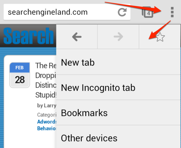
Android also promotes the use of what’s called an “Action Overflow” icon of three stacked boxes to bring up a menu within an app for additional actions. For example, the first arrow below points to the icon in Chrome on Android, and the second arrow shows how it brings up a box of options:
From Mobile To The Web
Many navigation or user interface elements Google launched initially for mobile eventually have turned into use on the Web, so it wouldn’t be surprising to see this become permanent.
Of course, Google is known for testing various user interfaces and algorithmic updates all the time. Not all of them become permanent.
In fact, Google recently was spotted testing hiding the search box completely. Google, however, has tested the navigation elements fairly often. Here are some of our reports on those user interface tests.
Postscript: A Google spokesperson told us “we’re always experimenting with the look and feel of our homepage.”
Other Google User Interface Changes:
- New Google Test: Remove The Top Black Bar
- Google Testing New Navigation Interface: New Ad Location To Come?
- Google To Replace Black Top Bar With Gray Colored Bar?
- Google Mobile Tests Large Black Menu Drop Down Bar
- Confirmed: Google Moving Search Options Above Results
- Google Mobile’s New Slide Out Black Navigation Bar
- Google Testing Toggle For Search Options & Tools In Search Results
- Google Testing Search Options Listed Above Results, Rather Than To Side
- Google Moves Away From Large Navigation Drop Down Menu
Related stories
About the author
In 2019, Barry was awarded the Outstanding Community Services Award from Search Engine Land, in 2018 he was awarded the US Search Awards the "US Search Personality Of The Year," you can learn more over here and in 2023 he was listed as a top 50 most influential PPCer by Marketing O'Clock.
Barry can be followed on X here and you can learn more about Barry Schwartz over here or on his personal site.