Run For Your Life, Chicken Little — The Google Mobilegeddon Is Coming!
Late to the game in overhauling your strategy in time for Google’s mobile-friendly algorithm? Columnist Will Scott advises you to start now with three easy steps.

Lately, Google has started telegraphing its punches to webmasters. Among the more recent announcements is that, starting April 21, Google will be rolling out an algorithm change which will favor mobile-friendly sites.
“So what?” you say. “My website looks fine on my iPhone when I pinch and zoom, right?”
Sadly, wrong!
Chances are it’s a little late in the game for you to overhaul your mobile strategy in a couple weeks, but you can get started now to be ready as the algorithm is refined and rolled out globally.
You Must Address Mobile, And Soon
Mobile Internet usage is growing at a startling rate. Within the last five years, we were telling clients, “Let’s worry about it when it gets to 20%.” For many of our clients in local businesses, mobile is now approaching 50% of their reported traffic and continuing to grow.
Recent ad campaigns we’ve run with a local focus on platforms like Facebook — without device targeting — have had greater than 90% of their views on mobile devices.
So, like it or not, mobile is a force to be reckoned with in regards to Google, SEO, and online marketing as a whole. And because bigger brands and sites have more resources to devote to mobile marketing, this will likely mean a continuation of the Google smack-down on smaller, local businesses that started with the Hummingbird algorithm.
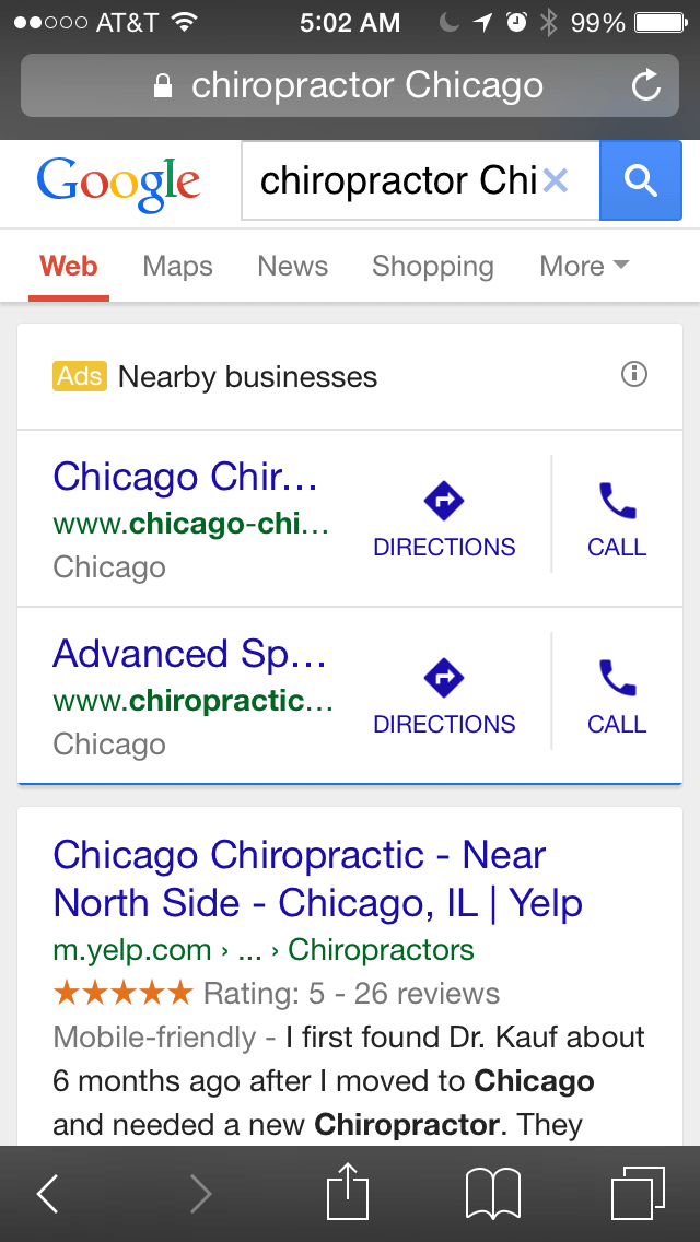
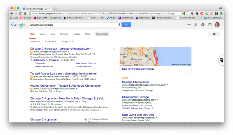
Or, to put it another way, when mobile matters, Yelp wins. (More on how you can take advantage of this later.) Take this search for “chiropractor Chicago” as an example.
Here it is in mobile:
And here’s what it looks like on your desktop:
So, what’s a local business to do? Here are three easy steps:
- Get a mobile site.
- Use “Barnacle SEO.”
- Focus on location, location, location.
Let’s talk about each one of these tactics.
How To Get A Mobile Website
Businesses have three main options to becoming mobile-friendly: responsive website design, dynamic serving, and separate URLs. Google recommends responsive website design, although it does not favor any particular format as long as the pages are accessible to the Googlebot.
A responsive site uses the same HTML code on the same URLs across all devices — your laptop, iPad, smartphone, etc. This kind of website can display differently based on the screen size. Sounds perfect, right? Well, the downside is that a responsive website design usually requires completely rebuilding your website. Even so, for businesses that see a significant amount of traffic coming from mobile devices, it is time to make the investment — your customers will probably thank you and Google will reward you for site usability.
A dynamic serving format uses the same website URL regardless of the user’s device, but generates different HTML based on the device type.
Finally, you can have your mobile site display on separate URLs (for example, m.domain.com vs. www.domain.com) which takes that a step further, detecting the user’s device and serving different URLs to each device type.
For businesses with growing mobile traffic that has not yet reached a critical percent of site traffic, a purely mobile version on a separate URL is a good option. When creating a mobile version of a site, you can use your full site or just a portion of your website. If you’re leaning toward only a portion of your website in the mobile version, consider including a handful of important pages or the top most-visited pages.
Barnacle SEO: An Oldie But A Goodie
Barnacle SEO, also known as the “If you can’t beat ‘em, join ‘em” strategy, is essentially a system in which you identify large, high-ranking websites and add your information to those online directories in the hopes of “borrowing” some of their page one rankings. Think of it this way: Your business needs to attach itself to a large, fixed object, and then wait for the customers to float by.
This basically means making sure you optimize your business profiles or business pages on high-ranking online directories (the fixed object) and promote them around the Web. There are lots of large, trusted websites and directories out there you can barnacle up to: Yelp, Angie’s List, Foursquare, Google+, Avvo (for lawyers), HealthGrades (for doctors) … even TripAdvisor.
Why are these online directories so important? It may come as a surprise to many webmasters, but oftentimes these trusted online directories provide customers with information that can’t be found quite as quickly on a local business’ website. That’s because websites like Yelp excel at providing the targeted information that local customers searching on their smartphones really need.
What’s more, these websites are optimized for the mobile experience — so that key, decision-making information, is quickly front and center.
In Mobile, No One Can Hear You Scream (Unless They’re in Your Neighborhood)
In July 2014, Google released the Pigeon algorithm update to improve user search experience by providing more useful, locally relevant results. With Pigeon, searchers now see search results with local businesses near their location.
Now, brick-and-mortar businesses with a mobile-friendly website will enjoy the additional ranking factors from the upcoming mobile-friendly algorithm. With mobile search location being an ever-moving target, these results are attempting to be more relevant — and more accurate — for the user than ever before.
This is obviously helpful to small businesses with an actual storefront in a market. Mobile puts these small businesses in front of their target market at the time and place searchers are looking.
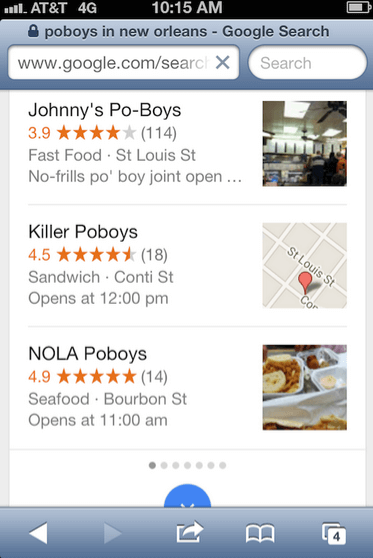
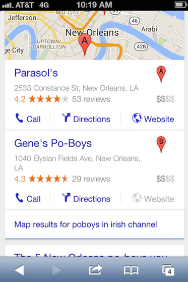
The challenge for local businesses is breaking into the top three local results — the ones you typically see on your cell phone.
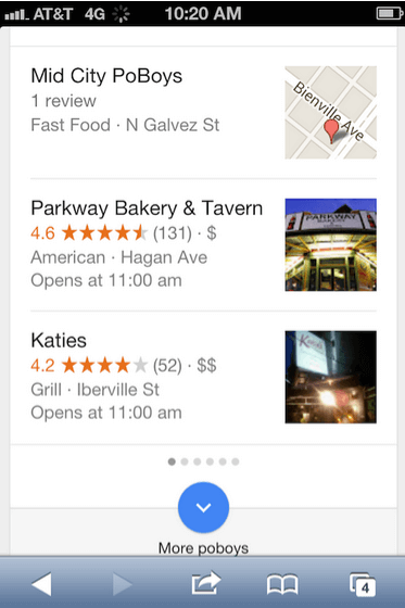
Hungry for lunch, I have an envie for a roast beef po’boy and need one near me. “Near me” makes a big difference here, because I don’t want all of the po’boy joints in all of New Orleans.
I want one near me now…
…or a po’boy near where I will be in an hour.
Depending on your industry, your business’ success could be tightly tied to how easily your customers can find you — not only on their computers, but also on their phones.
So, What’s Your Very Next Action?
As with all Google algorithm updates, you’ve got to give it time. We usually recommend giving it 60 days to see the full impact. And even then, there are revisions and updates and you just don’t know.
In the meantime, however, you can work on ensuring that your site is truly mobile. (Hint: just because your Web developer tells you it is, doesn’t make it so.) Use Google’s handy mobile-friendly testing tool to check your website.
A really workable solution for many local businesses are tools like Duda. Duda’s mobile site builder sucks in all the data from your site and allows you to create a pretty robust, yet simple, mobile version of your site. You’ll still need your Web developer to hook it up so Google can make the association to your site, but it works.
Finally — and this should already be a part of your process — look for opportunities to list your site on authoritative, locally-focused directories and community sites.
I’d be surprised if Yelp and the other big directories lose any ground in this latest Google turf war, but by doing the work to be ready, you at least have a fighting chance.
What do you think? Is Mopocalypse hyperbole? Or is the world really about to end?
Contributing authors are invited to create content for Search Engine Land and are chosen for their expertise and contribution to the search community. Our contributors work under the oversight of the editorial staff and contributions are checked for quality and relevance to our readers. The opinions they express are their own.
Related stories
New on Search Engine Land

