Google Maps gets brighter UI, new category icons and more color-coding


Google is updating its Maps look and feel. The company has changed colors and added icons to correspond to places and business categories. The palette is also brighter.
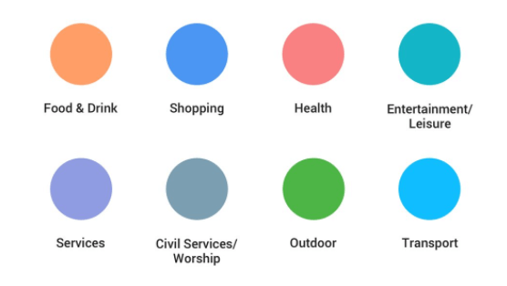
Food and drink is orange or gold, shopping is royal blue, services are lavender, entertainment is turquoise, outdoor activities and places are green and so on.
Google says in that context it will also highlight places it believes are relevant to your query or need (e.g., explore, driving, transit). Here’s what the new UI looks like:
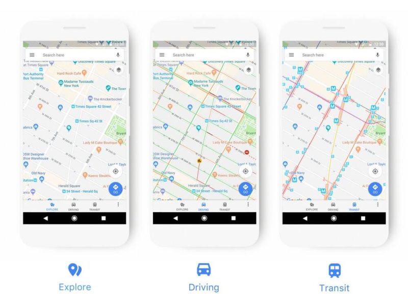
The company says the changes will roll out over the next several weeks and be reflected on all “products that incorporate Google Maps, including the Assistant, Search, Earth and Android Auto.” These UI changes will also appear in third-party apps and sites that use the Google Maps API.
Google Maps, a cornerstone of its mobile strategy, is one of five Google products that have over 1 billion users. The others are Search, YouTube, Android and Chrome.
Explore more on
Editorial disclosure
Contributing authors are chosen for their expertise and work under the oversight of the editorial staff. Search Engine Land is owned by Semrush. The contributor was not asked to mention Semrush; the opinions expressed are their own.
About the author