Meet The New Google Look & Its Colorful, Useful “Search Options” Column
After months of testing, Google is releasing a new look-and-feel for its search results today, a three column design that provides a permanent menu of search options and tools to help searchers refine their queries. Google also gains a freshly-updated logo along the way. The new user interface — UI for the tech crowd — […]
After months of testing, Google is releasing a new look-and-feel for its search results today, a three column design that provides a permanent menu of search options and tools to help searchers refine their queries. Google also gains a freshly-updated logo along the way.
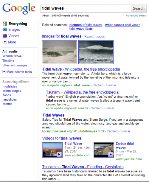
The new user interface — UI for the tech crowd — places search options into a column on the left-hand side of the search results page. Search results themselves appear in the middle, in a wider column. Ads appear in the right column, though some ads continue to appear in the middle column above editorial picks:

To me, the new look is colorful yet clean and not distracting. It should make it easier for searchers to drill-down further into their queries. Having personally tested it in the past, when I’ve been included in Google’s trial tests like many others picked randomly, I’m glad to see it finally go mainstream. It rolls out today worldwide in 26 languages. Google tells me that by the end of the day, everyone should see the new look.
Many of the options in the new left-hand search options column aren’t new. Google made many of these features available a year ago and then expanded them last October (see Up Close With Google Search Options). However, in order to find the options, you had to “open up” the search options column that by default was left off. Today’s change opens up the column permanently, which should cause many more people to make use of these.
The move to a permanently three-column design sees Google following in the footsteps of Ask.com, which pioneered the look back in 2007. Bing and Yahoo followed the three pane trend in 2009, and now it has effectively been given the stamp of approval by search giant Google itself.
Below, a closer look at the new design and options, followed by some history and background.
Search Options Column
The new search options column (or left panel, as Google calls it internally) is devoted to ways for people to refine their searches:
Within the column are three sections, which I’ll cover in turn.
The top portion lists “content types,” that is, the types of content that a search can be narrowed to. For example, in the search below for tidal waves, you can see that the results contain things like web pages, images and video matches, all blended together in the same column as part of Google’s Universal Search system:
That the default “Everything” search — where Google is mixing together everything it believes is relevant to your query, regardless of the exact content.
Filtering By Content Type
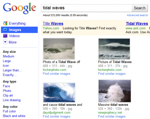
What if you’d like only images of tidal waves? That’s where the colorful content type choices come in. Select “Images” and that content type gets highlighted in blue, to indicate that the results to the right have now been filtered to show only image matches (along with, oddly, two ads from Google rivals Yahoo and Ask both hoping to catch some Google searchers):
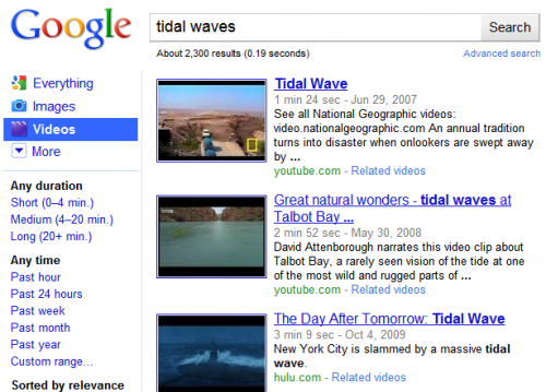
Similarly, select the Videos option, and now only matching videos are shown:
Exactly which content type options appear depend on the actual query. Google says it automatically tries to highlight the most relevant filtering that people may want, based on the content that it finds for a search.
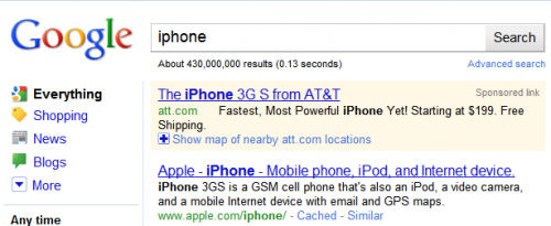
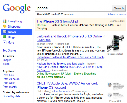
For example, the tidal wave search above features options to narrow by Images and Videos. But a search for iPhone provides provides different narrowing options:
Now the choices are to narrow by Shopping, News and Blog content. The assumption is that people searching for iPhone information may be most interested in these categories of results, while those searching for tidal waves may be more interested in images or videos. As before, selecting one of these other options narrows to the particular content type, such as how choosing News brings back only news content about the iPhone:
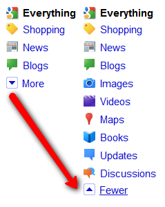
Not happy with the content choices that Google features by default? That’s where the “More” option at the end of the list comes in. Select that, and you can see all available options:
Sources Of Content
Where’s all this content coming from? Google has many specialty search engines that it taps into. Below are the ones that the new menu gives access to:
Blogs: Google Blogs, blog and RSS/feed content from across the web. See our Google: Blog Search category for more background.
Books: Google Books, book results from Google’s library scanning project and books contributed by authors and publishers. See our Google: Book Search category for more.
Images: Google Images, matching images from around the web. See our Google: Images category for more.
News: Google News, news and blog content from across the web. See our Google: News category for more.
Maps: Google Maps, maps and local listings from across the web and third-party sources. See our Google: Maps & Local category for more.
Shopping: Google Product Search, product and shopping listings from across the web. See our Google: Product Search category for more.
Videos: Google Video, video from across the web — including Google-owned YouTube but not limited to that. See our Google: YouTube & Video category for more.
Updates: Google Real Time Search, which shows the latest information found by Google from sources such as news, blogs and especially social sharing sites such as Twitter, Facebook and MySpace. Unlike the other services above, Google Real Time Search does not have a standalone site that you can use. See our Google: Real Time Search category for more information.
By the way, Google does have more specialty or “vertical” search engines than the ones listed in the new content types area, including:
Why don’t these show up as content types? This is because Google only shows content types for the search engines it automatically checks for any query.
In other words, do a search, and Google’s Universal Search system automatically checks places like Google Images and Google Books for matches. However, it doesn’t automatically query places like Google Finance or Google Scholar. So, those don’t appear as narrowing options.
To further confuse matters, Google also has a few specialized search tools that DO automatically get checked for any query, such as Google Music, Google Health, movie times and more. However, you can’t narrow results to these. These results only show within special “OneBox” units.
Search Tools
If you’ve made it through digesting the new content types in the search options column, there’s more fun in store midway down, in the search tools section. This allows you to narrow results within a content type by time or by other relevant filters.
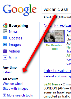
As with content types, what appears by default will depend on the type of query issued. For example, for volcanic ash:
“Latest” is shown as a time filtering option, which makes sense given that many people may seek the latest results on this breaking news topic.
In contrast, consider these filtering choices for iPad:
“Latest” returns as a time filter, along with “Past 3 Days.” But more interesting are the “Fewer shopping sites” and “More shopping sites” options. Again, these make sense. For this query, Google can safely assume many people might be interested in shopping info about the iPad. However, a good chunk of people might also want more informational pages about the iPad — hence a handy ability to “deshoppify” the results.
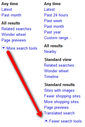
As with content types, if you’re not happy with the default search tools picks that Google makes, you can use the “More search tools” option to see a full range. Here’s what you get doing that from an “Everything” search:
Time Filtering
The first set of tools involve filtering by time — narrowing to “Latest” results, past 24 hours, past week, month, year or even a custom date range, complete with pop-up calendar picker:
Occasionally, I’ve also seen other options appear, such as “Past 2 months” or “Past 3 days,” as noted above.
While time filtering sounds great, my experience over the years has been that search engines, including Google, often get the dates wrong on pages for a variety of reasons. For a deeper drill-down on these issues, see these past articles:
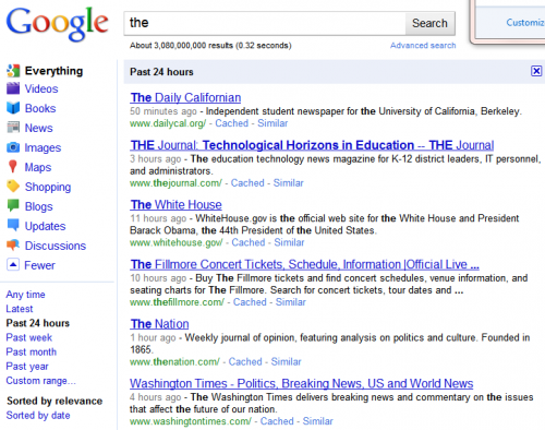
If you select a date option, by default results will be sorted by relevance within that date period. For instance:
Above, I did a search for the word the, narrowed to the past 24 hours. I like this search because it points out one issue with date filtering. Notice the White House home page is third on the list, with a time of 11 hours ago. That’s not the time the page was first authored — the White House has been online much longer than that! It might be the time when Google last noticed a change was made to the page. It could also simply be the last time Google visited the page. Such are the issues when filtering by date.
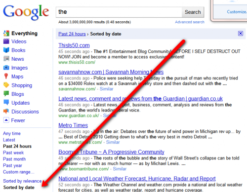
Mainly, however, notice that the pages are not listed in chronological order. Some “fresher” pages appear below older ones. That’s because the default sort is by relevancy. However, select the “Sorted by date” option, and this changes:
Nearby Filtering
Another option is the ability to filter results to those near your location — at least the location Google assumes you’re at, which it determines by the internet address (IP address) reported by your internet service provider, company, school or organization.
Nearby filtering sounds great. For example, a seach for topics such as bicycle rentals or zoos or moving companies when toggled to “nearby” should bring back results relevant to your particular location.
Unfortunately, I didn’t find using the option made much difference, much as was the case when we first reported on it being offered in Feburary (see Google Adds “Nearby” Local Search To Options Panel). In part, I suspect this is because Google already does localizing of results by default, through its personalized results. For instance, since Google already knows I’m in San Francisco (at the time I wrote this), many of my results I tested already had San Francisco-related material ranking highly. In effect, I was already being shown “nearby” results even without clicking on that.
The nearby options are shown below. When selected, you can further refine “nearby” to mean at your city, region or state level — as well as entering a custom location, if Google’s not detecting your area correctly:
View Options
Further down, there are three alternative “views” you can apply to your results other than the default “standard” view:
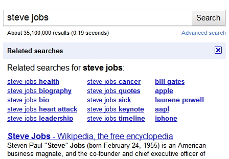
Related Searches puts a list of queries related to your original search at the top of the search results:
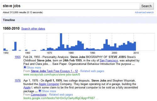
Timeline tries to build a timeline of interesting facts related to your query, by exacting information about the subject that’s associated with particular dates on web pages. You get a chart and facts listed in chronological order:
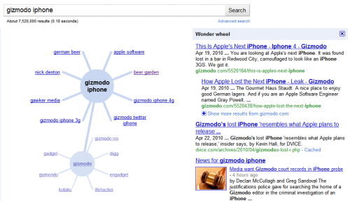
Wonder Wheel is a visual refinement tool, which allows you click your way through related topics as they emanate out like spokes on a wheel. Each click to a new topic causes the results shown alongside the current “wheel” to change:
See also The Google Wonder Wheel & Other Search Refinement Features Get Live Test for more about using the tool.
More Filtering Options
After the view options are additional ways to filter your results, some of which really belong either as additional view options or content type options, in my opinion, as I’ve written before. The options:
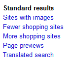
Sites With Images gives you what’s promised — web sites that also have images. Since most web sites have images, it’s hard to imagine this being that useful. But if you really want to read something and want pictures to go with it, maybe it’s worth a try. Here’s an example of what you get:
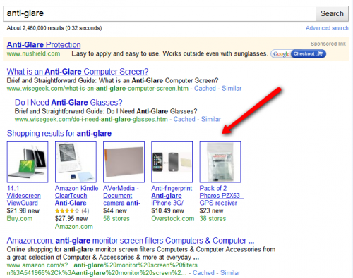
Fewer Shopping Sites / More Shopping Sites feels a lot like the Nearby option — it makes slight changes to the results that can be hard to notice. The main thing is that if you don’t like getting a Google Shopping one box unit like this in your results:
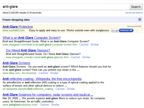
Then using the Fewer option makes it disappear:
Using the More Shopping option also makes it appear. But if you’re really after shopping results, it makes more sense to use the Shopping content type option.
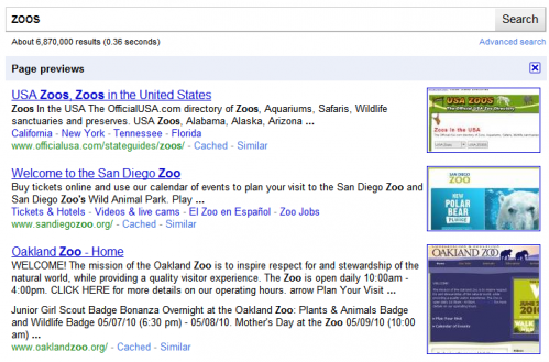
Page Previews will insert little thumbnail images of pages listed in the results:
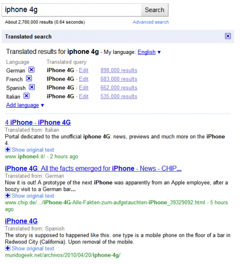
Translated Search is kind of neat. It shows results that are not in your native language (as detected by your browser) and translates them into your language.
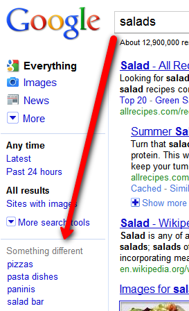
Something Different
Finally, the last portion of the search options column is called “Something Different.” It’s meant to suggest other queries that are related to your original one. For example, for Steve Jobs, people like Bill Gates or Michael Dell are suggested:
For a generic term like salads, you get items like pizza or salad bar suggested:
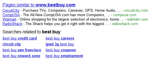
Somewhat related to this is a new feature that came out last week, “Pages Similar To” — not to mention a long-standing feature, “Searches related to.” Both are shown below, in how they appear at the bottom of the search results for best buy:
You can see how Google suggest related pages — which really are related companies like CircuitCity or Walmart. That can be handy for searchers, though it probably drives some brand holders crazy that Google’s recommended their competition (similar to how it does this on Places pages in Google Maps). Below this come suggested searches.
Bottom Redesign
As long as we’re at the bottom of the search results, it’s also worth noting they’ve gotten a facelift as part of the new look and have been cleaned up. The old:
and the new:
Specific Search Tools For Specific Content Types
When I covered search tools above, I looked at what appeared in response to an “Everything” search. However, when you drill into particular areas, the Search Tools may change — sometimes dramatically so.
For example, in a search for iPhone narrowed to Images, you get new options designed to let you narrow by size, type (face, photo, clip art, line drawing) or by color:
Narrowing to video brings up video-related options such as length of clip, time it was published, video quality, use of closed captioning and source of clip:
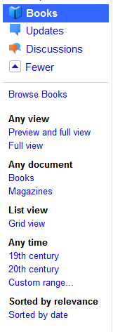
Filtering to books allows options to find books that are “full view” (you can read them in their entirety), to filter to magazines, to see results in a grid display and even filtering time …. by century!
Selecting discussion allows for special filtering such as discussions on forums versus Q&A sites as well as “short” versus “medium” and “long” discussions:
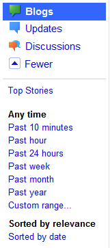
For blogs, there are short time options, such as 10 minutes or the past hour:
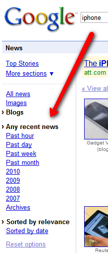
For news, there are options to see “all news” versus news images or news from blogs:
If I click to filter to news content from blogs, I also get specialized time filtering options, such as over the past hour or for particular years, 2007, 2008 and so on:
Also notice how the colorful content type bars have suddenly disappeared. That second drill-down kicked me over into Google News itself, rather than the main Google.com site — and the new UI didn’t carry through there.
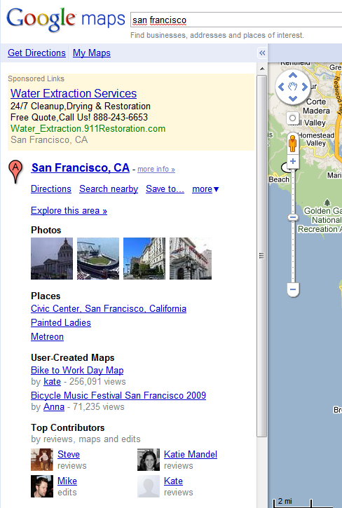
Things like that also happen if you use either the Shopping or Maps areas. Drilling into these bring up specific options but not keeping the look-and-feel of the new left column. Shopping looks like this:
You can see that once you go into Shopping, all the other content type choices disappear. You can’t “tab” back to them.
The same is true for Maps. In addition, three column design goes away, falling back to two columns — one on the left for listings and textual infomation, while the right column is for the map itself:
Google’s aware of the issues with Shopping and Maps.
“We’re just not there yet, but they’re coming soon,” said Johanna Wright, director of product management at Google.
A New Logo
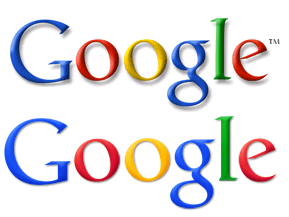
In other changes, Google’s logo has had a facelift. Gone are the heavy drop shadows. The colors are said to be “punched up,” and did you know the Google L was a bit crooked? It’s had a nose job now. The old and new:
Also gone is the trademark notation, TM. Google said it didn’t show well on smaller sizes of its logo and that it was determined to be no longer necessary to show.
Playing Copycat?
Back in June 2007, Ask.com made a splash with its new three column look called “Ask 3D.” The left column was used to present search refinement options, similar to how Google is showing them generally now. The middle column had results. Unlike Google, the third column didn’t have ads but rather was used for vertical search results.
Two years later, in June 2009, Microsoft relaunched its search engine as Bing. It also used a three column design, with the left column for search refinement options.
Then in August 2009, Yahoo did the same, a three column design, with left column used for refinement (see )
Now Google has made the jump, raising the inevitable question — isn’t it just copying the others?
“We have been working on a left-hand nav since 2006 and in mocks far before that,” Wright said.
Indeed, left-hand navigation was spotted in the wild back in December 2005, though it was very rudimentary. And arguably, Google had a solid three column look when the search option column was unveiled as a user choice last year, just before the Bing launch.
I doubt that will prevent Bing from poking fun that Google’s just copying them — much less people from Ask back who were there back when Ask 3D launched under then CEO Jim Lanzone from feeling like everyone is copying them. Ironically, Ask dropped the three column look about a year later after a management change.
Why Now?
Fun about who is playing copycat aside, why has it taken so long to finally get a three column design, a format that Google’s vice president of search product and user experience Marissa Mayer described last November as a “universal truth,” to finally become a permanent addition to Google? (See Google Tackles Its “UI Jazz” Problem, Tests Streamlining Search Options Feature for her comments and some of the design philosophy behind today’s changes)
“The real issue for us has really been when our technology would be powerful enough and relevant enough that it [search options] deserves to be on the results pages,” Wright said.
For related news, see here and here on Techmeme.
That’s a key issue. Google doesn’t want to have the same options showing up all the time, regardless of what someone searches on. It aims to have only the most relevant options appear, so they stand out and are useful.
We’ll see how well Google hits that goal. Some options offered don’t always seem useful; some don’t perform as dramatically as I might have expected, with very limited testing that I’ve done so far. But often they do work very well, and I’m certainly glad to have them within handy reach, rather than having to search, then push a button to get access to them.
And do people really use them?
“Absolutely. We don’t want to give out any numbers here, but we’re definitely seeing more usage of the tools and the properties,” Wright said.
Postscript (May 7): For the most part, I’ve not seen huge outcry against Google’s new look. Given the number of people who use Google daily, it pretty much seems to have been accepted without much protest. But not everyone is happy. Here’s a long thread on Google’s support forum where some people don’t like it and want an option to have “old” Google. That seems like a good option for Google to offer. However, my experience is that Google won’t do it. When they roll out changes, they pretty much force everyone to see them. I am checking on this, however.
Contributing authors are invited to create content for Search Engine Land and are chosen for their expertise and contribution to the search community. Our contributors work under the oversight of the editorial staff and contributions are checked for quality and relevance to our readers. The opinions they express are their own.
Related stories
New on Search Engine Land

